


Lifecycle
Contents
The lifecycle insight visualizes new, returning, resurrecting, and dormant users.
It shows what's below the surface of your user growth. For example, you could have stellar growth due to marketing efforts, but users churn quickly. This can lead to trouble as you're unable to retain existing users.
This insight give you a place to start investigating issues like increased churn or decreased acquisition of new users.
Creating a lifecycle insight
- Click Product analytics on the left sidebar
- Click the + New Insights button
- Select the Lifecycle tab
Configuration
Lifecycle determines whether a user was active during your selected time interval and whether they were also active in the previous interval. Users who first appear as 'new' might have had prior anonymous events, but their lifecycle starts only when they are identified. Anonymous events are excluded from this calculation.
Events
To start, you need to select an event or action that represents lifecycle activity. It is likely something users do repeatedly like a pageview, logging into your app, or performing a key action. For example, in a messaging product, you might consider someone active if they've sent a message within the interval.
The below examples show the Sent a message event to define user activity:
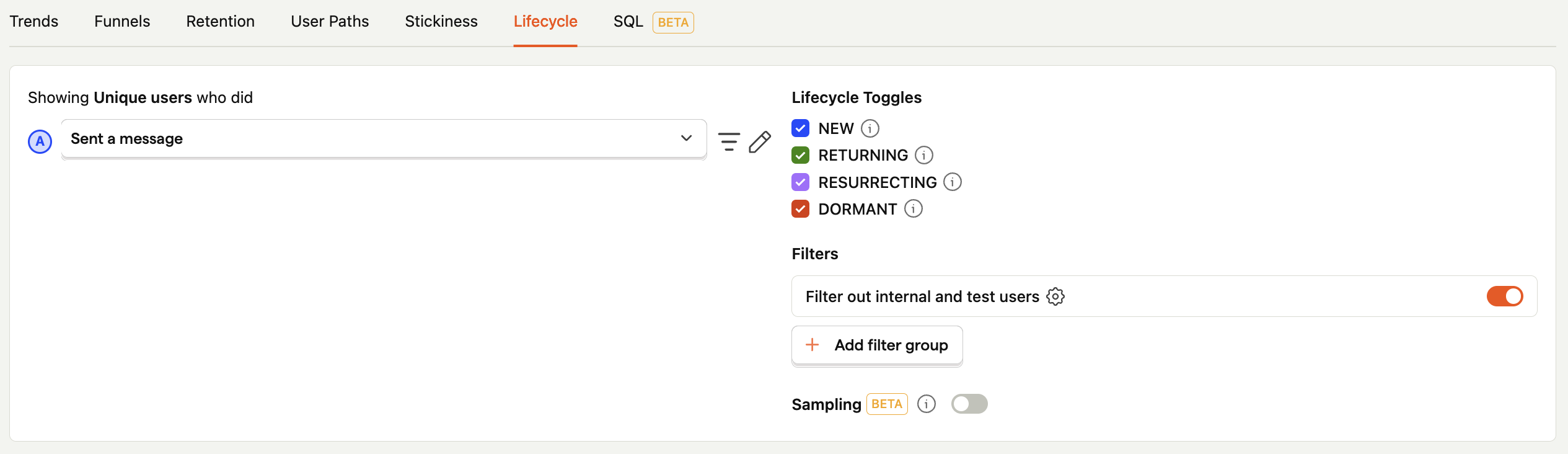
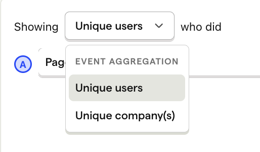
Aggregation type
The default aggregation is by user. However, you can also aggregate events by groups if you have any set up.
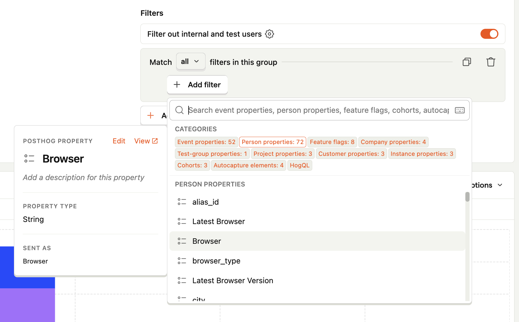
Filters
As with other tools in PostHog, you can add filters to focus on a subset of events.
Time range
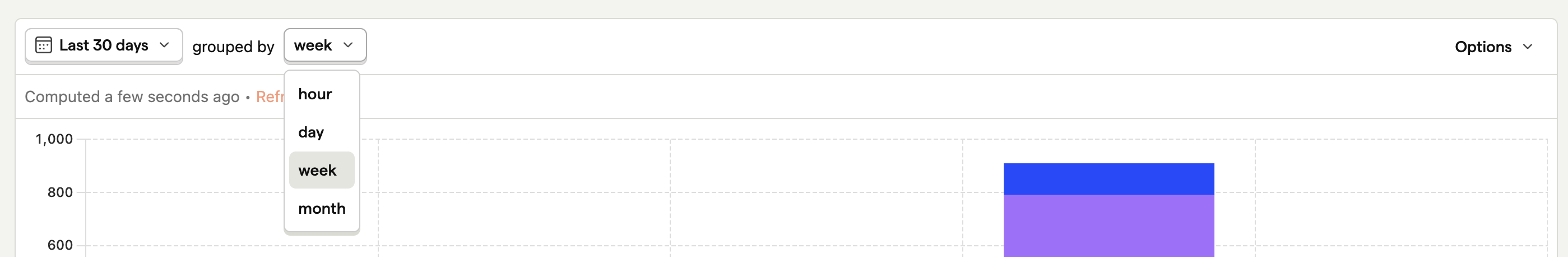
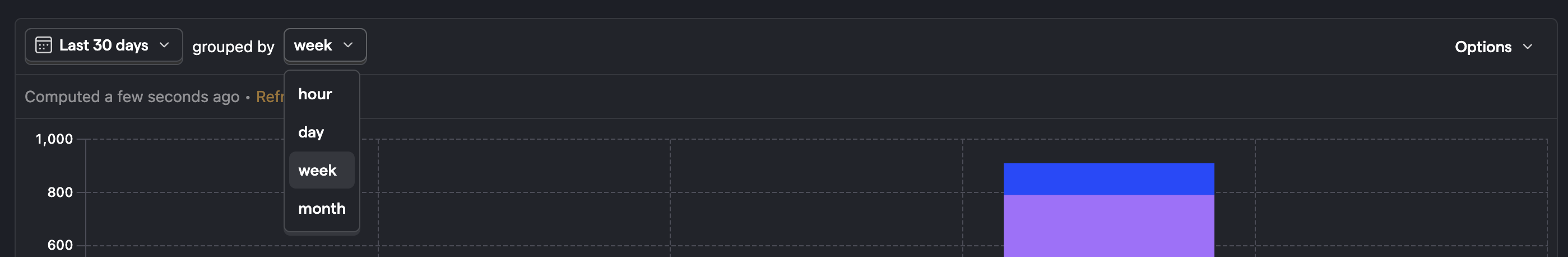
You can set the time range along with the time interval aligning with the natural frequency of your product by updating the grouped by setting.
Continuing with our messaging app example below, we group by week as we expect people to be sending messages every week. Depending on how people use your product, you might want to group by hour, day, or month.
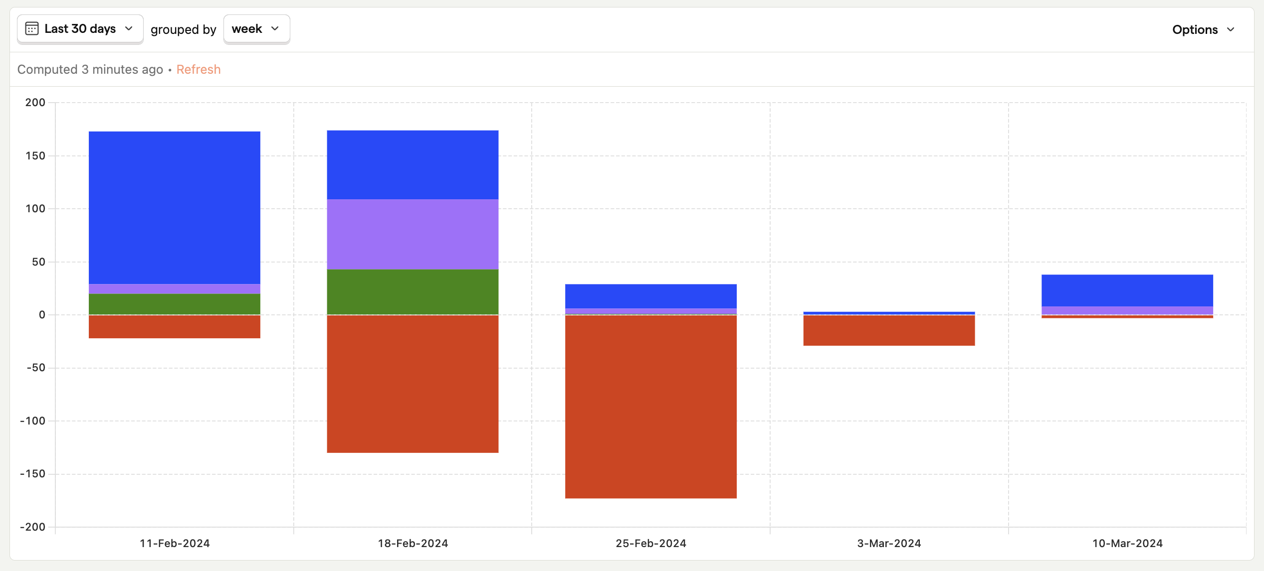
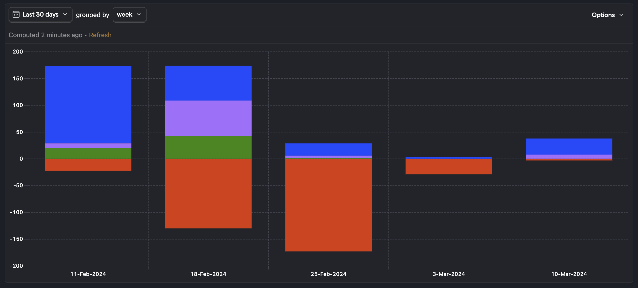
Interpreting your lifecycle
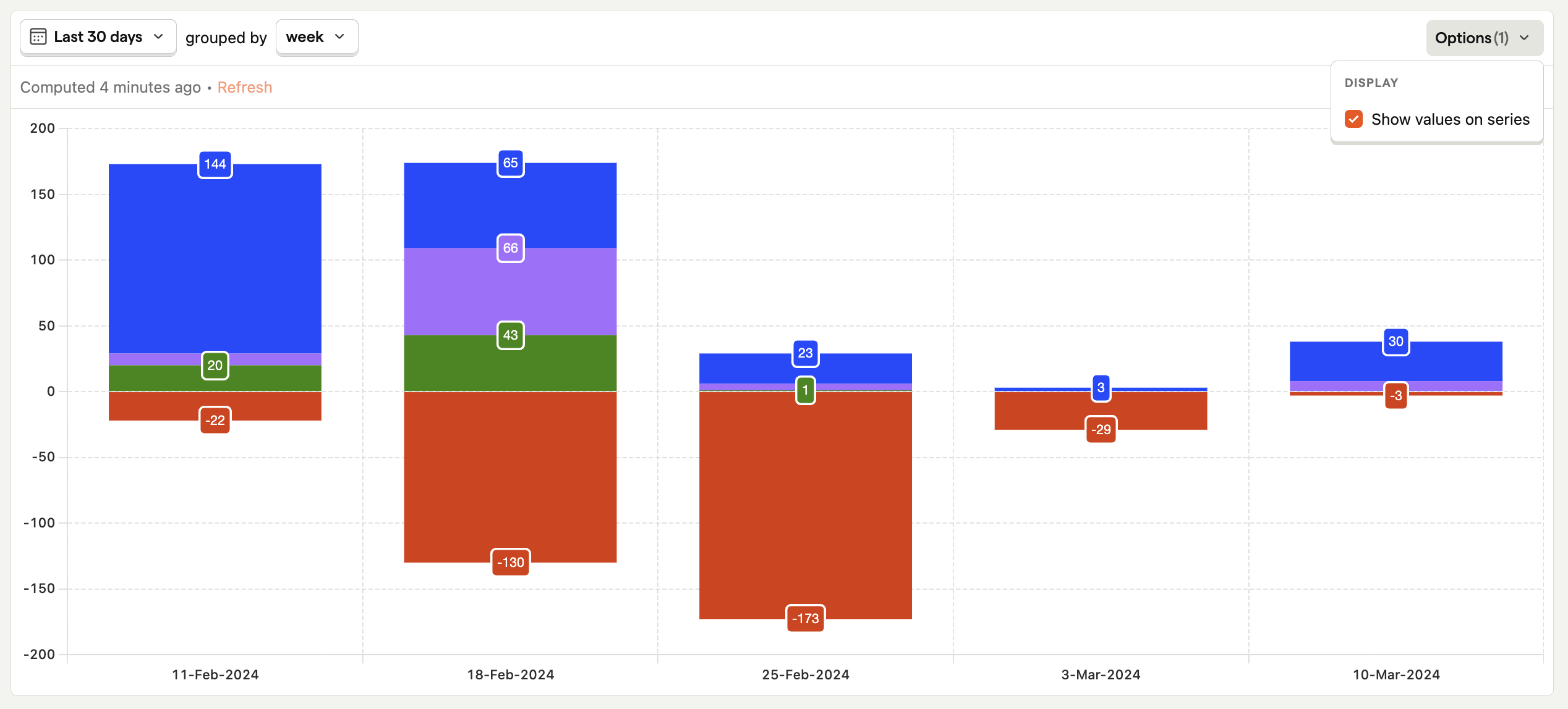
Here's an example lifecycle insight:
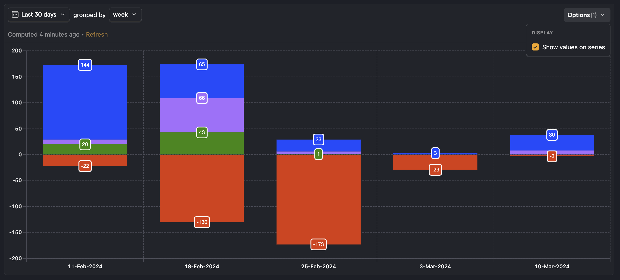
You can also click on the Options button and select Show values on series to display values on the chart for more details:
To see the relative breakdown of each status within a time interval, enable Show percentages on series in the Options popover. When combined with Show values on series, each segment label displays both the count and its share of the band total – e.g. 580 (42%). You can also enable percentages on their own to show only the percentage – e.g. 42%.
Everything above the zero on the horizontal access represents a user who was active in the interval:
- New (blue) - Users who did the event or action during the interval and were also created during that period – e.g. created an account and sent a message today.
- Returning (green) - Someone who was active in the previous interval and is also active in the current interval – e.g. sent a message yesterday and also sent a message today.
- Resurrecting (purple) - Someone who was not active in the previous interval but became active once again – e.g. did not send any messages for 10 days, but sent one today.
Everything below the zero represents a user who was not active in the interval:
- Dormant (red) - Users who are not active in the current interval, but were active in the previous interval – e.g. someone who has not sent a message today, but sent one yesterday.
What to look for in your lifecycle chart?
This can vary a bit depending on your product, but in general:
- You want to see your returning users growing or at least staying constant, otherwise this signals a leaky bucket problem.
- If you have a large number of resurrecting users it could mean that the interval you selected is not aligned with your product's true natural frequency. For example, users use it weekly but you've selected a daily time interval,
- If you're investing efforts in acquiring new users to your product (or the feature you're exploring), you want to see that this indeed translates in new users in the lifecycle chart.
Follow up questions you may want to ask are:
- Are users retaining better and experiencing value over longer-term periods?
- What type of users are churning? Are users who signed up recently churning or is it users who signed up a long time ago?
Our retention and stickiness insight are also good visualizations for figuring this out.
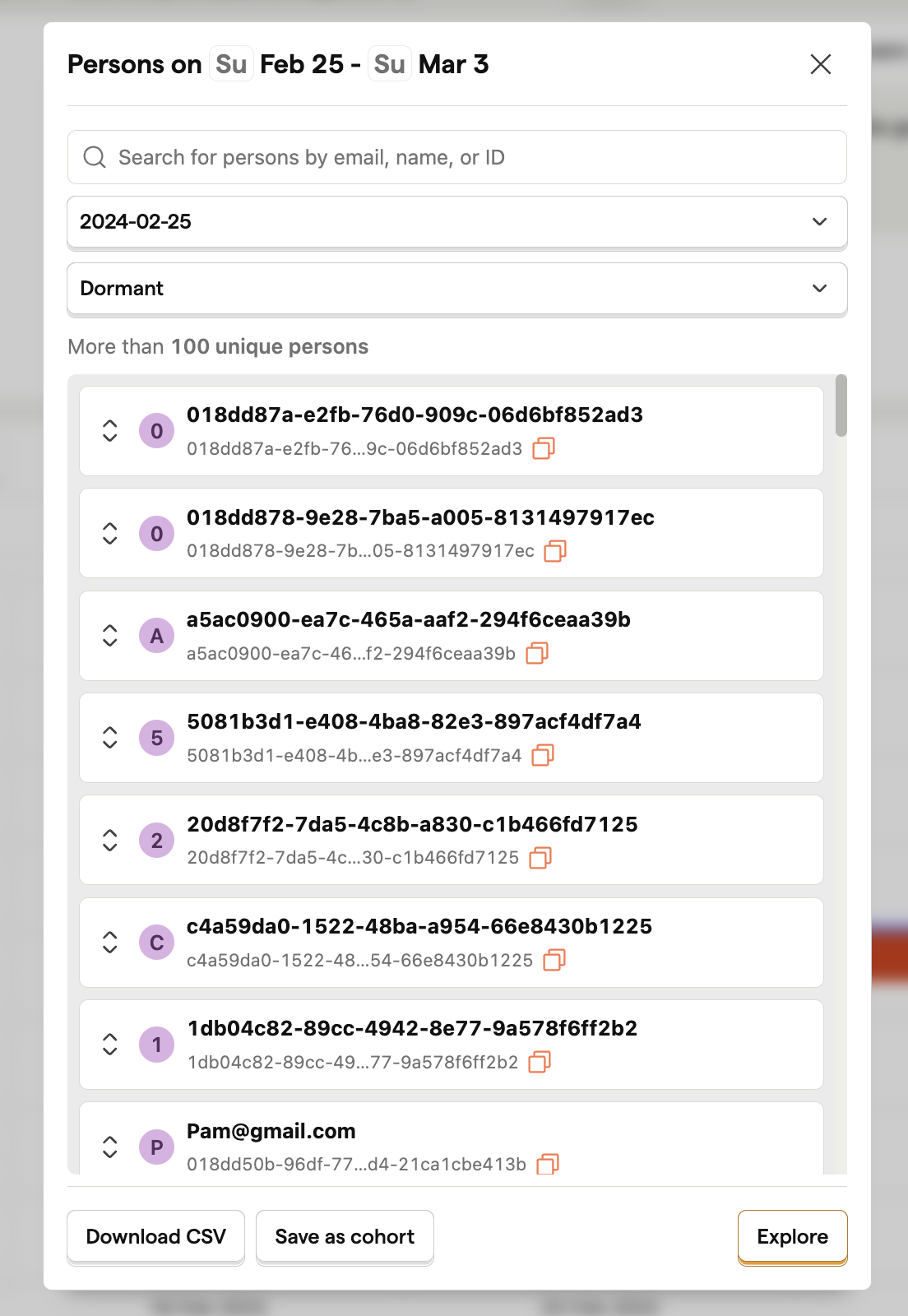
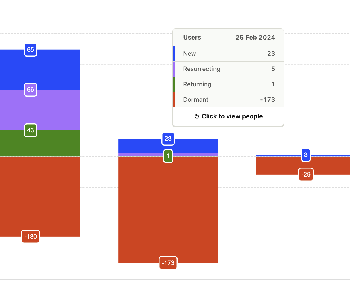
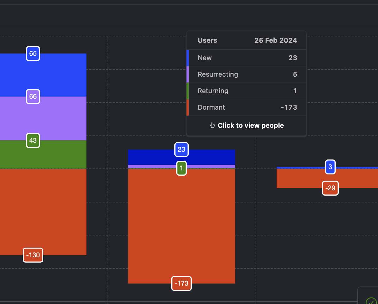
Viewing individual users
You click on a lifecycle section to view the people in it. For example, if you click on dormant users in the graph, PostHog shows you the users who became dormant here:
You can then click through to look at these individual users behavior in the events or session replays, or create a cohort for further analysis.