


Charts
Contents
There are nine charts and visualization options in trends. They're split into two categories:
- Time series, which show you how tracked events and data points fluctuate over a time period.
- Total value, which show the total number of tracked events or data points in any given time period.
Time series
Line chart (linear)
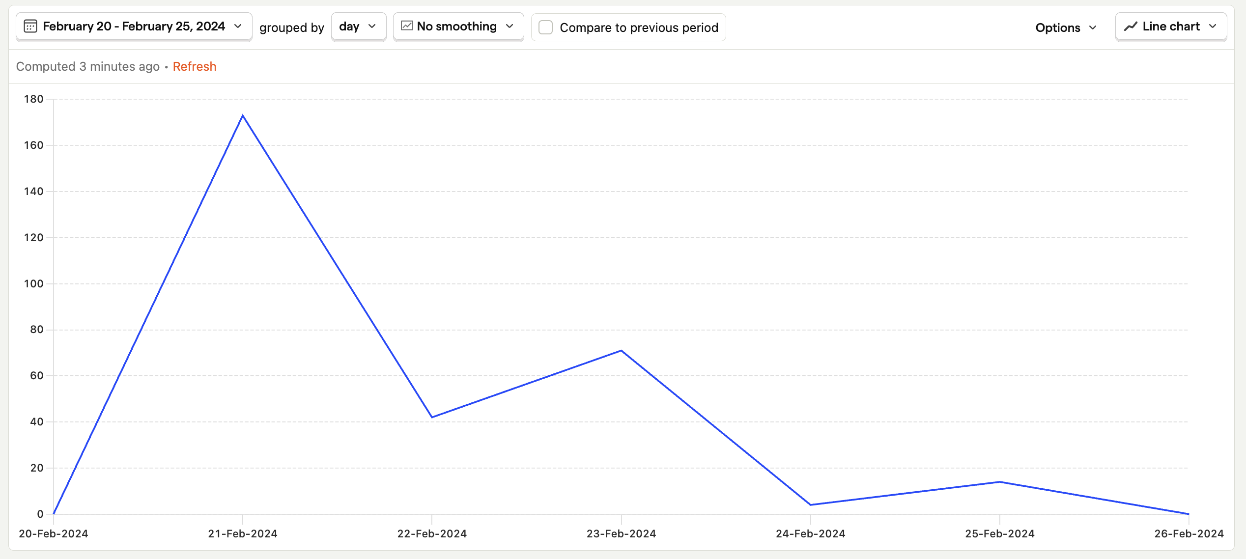
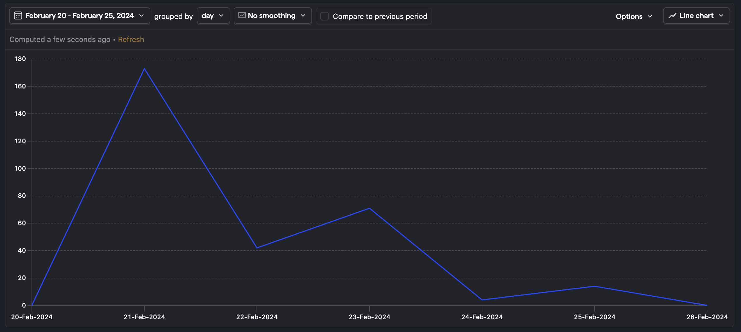
The line chart is a simple, linear trend plot with time on the X-axis and each data point corresponding to the grouping value you've chosen.
Additional series or breakdowns you add to a line chart will appear as separate lines on the chart.
Line chart (cumulative)
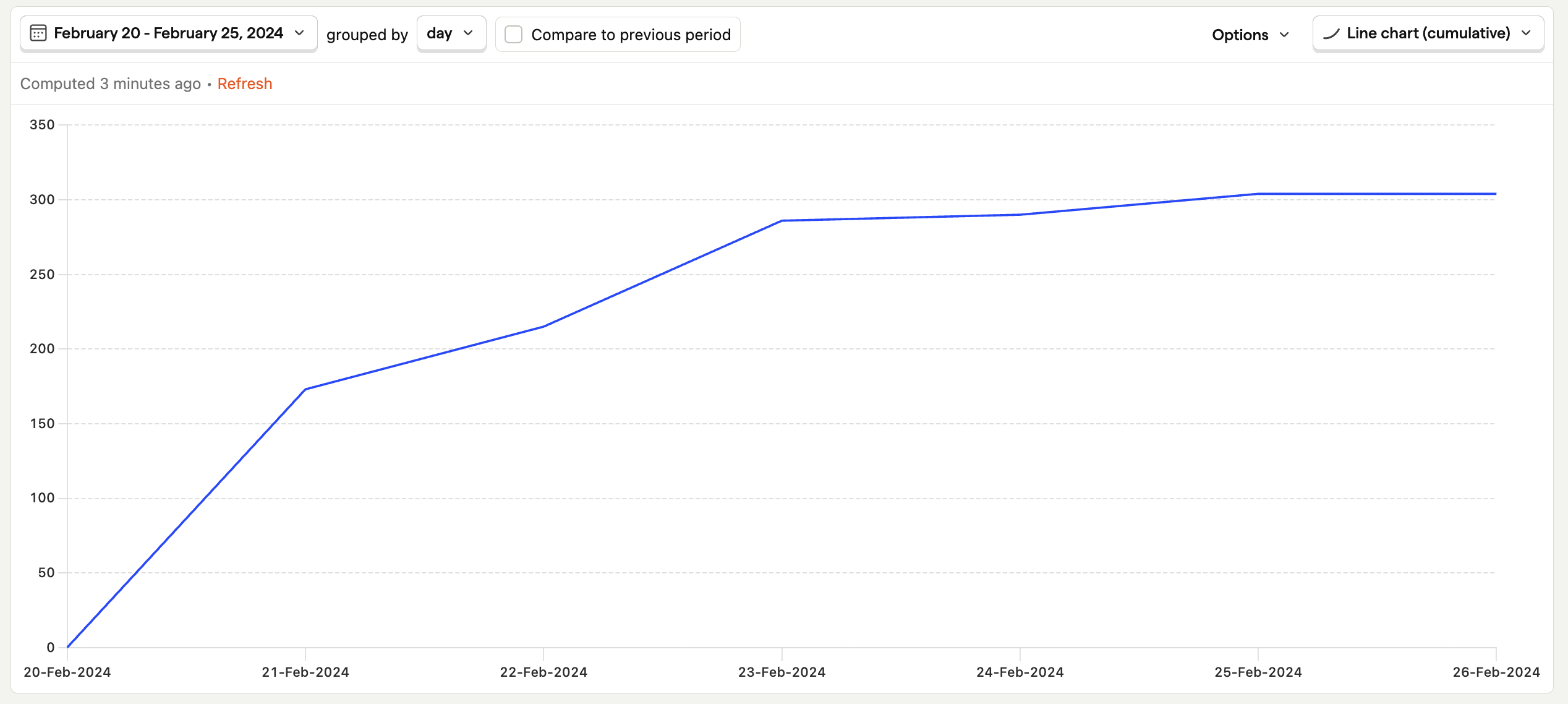
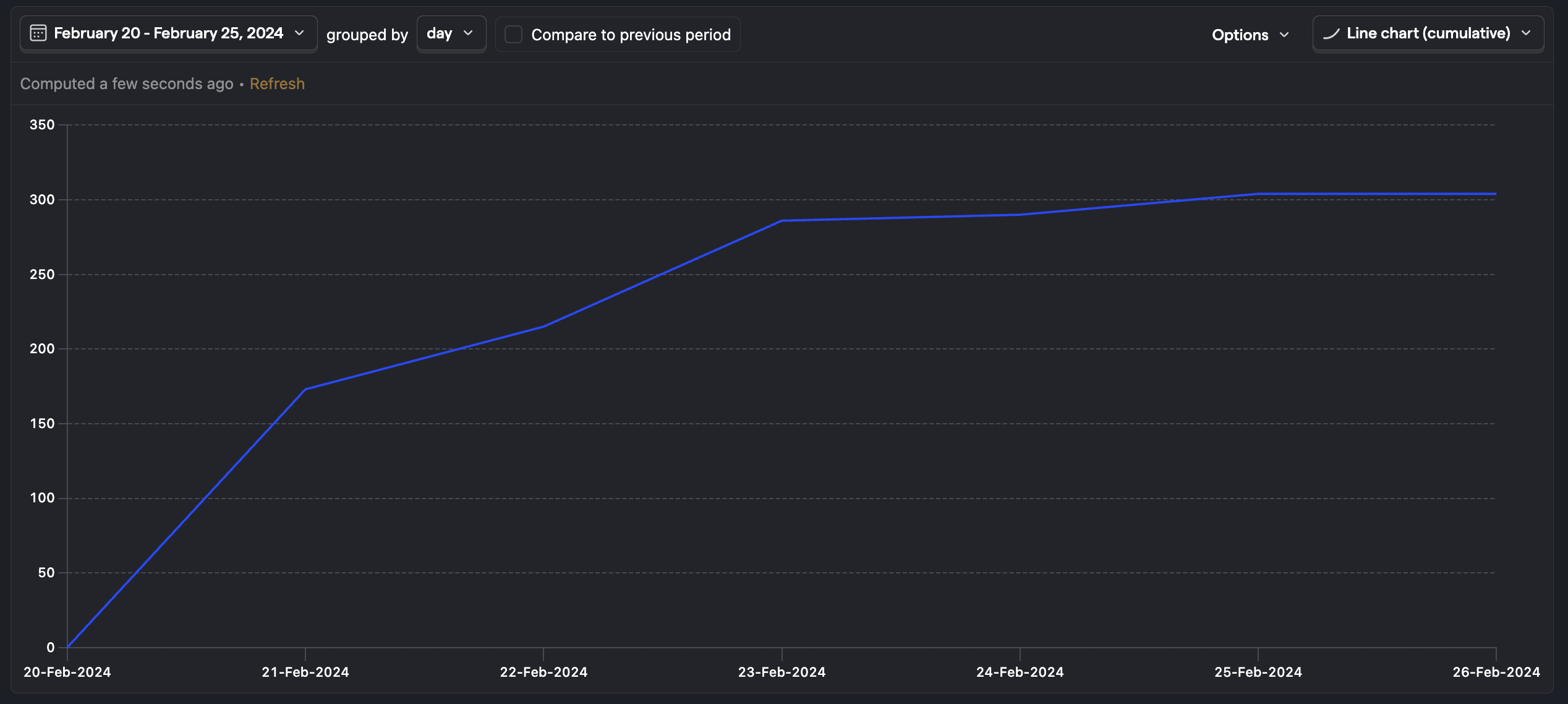
The cumulative plot displays a running tally of each series over the given time period.
This is useful for understanding how quickly an event or data point is growing, such as whether the number of people signing up for your product is growing exponentially or leveling off.
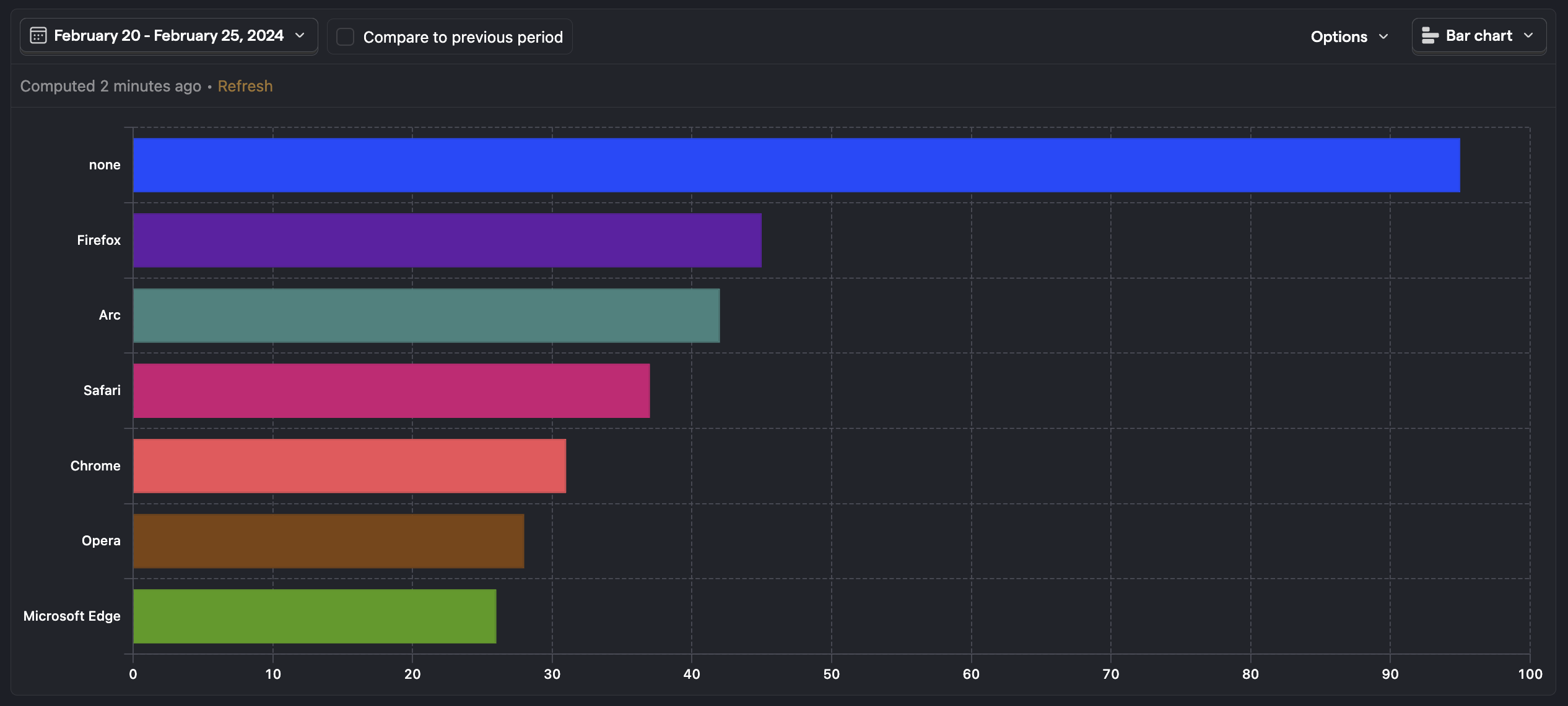
Bar chart
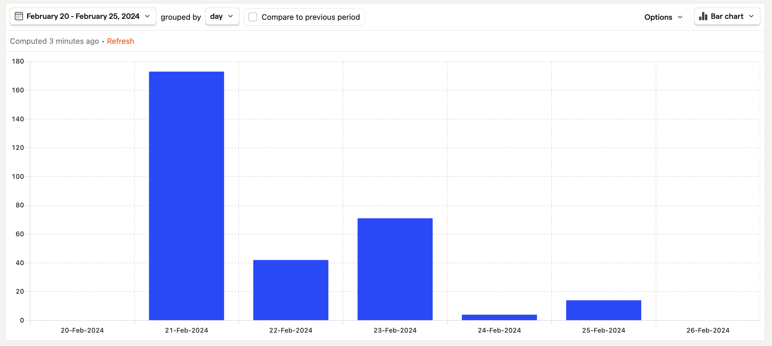
The time series bar chart displays the value of a series over time. This plot shows the exact same information as the linear chart, but in a slightly different visual manner.
Additional series or breakdowns you add to a bar chart will appear stacked, so you can see how much each property or series contributes to the total number.
Area chart
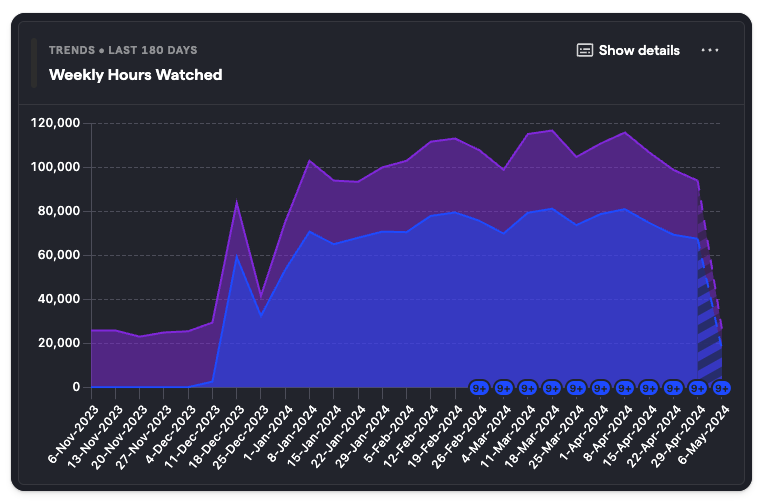
Area charts are a twist on the line chart. When you add a breakdown, or multiple series, area charts behave like a stacked bar chart, but render the data in a line chart showing how each data point contributes to the total.
Total value
Number
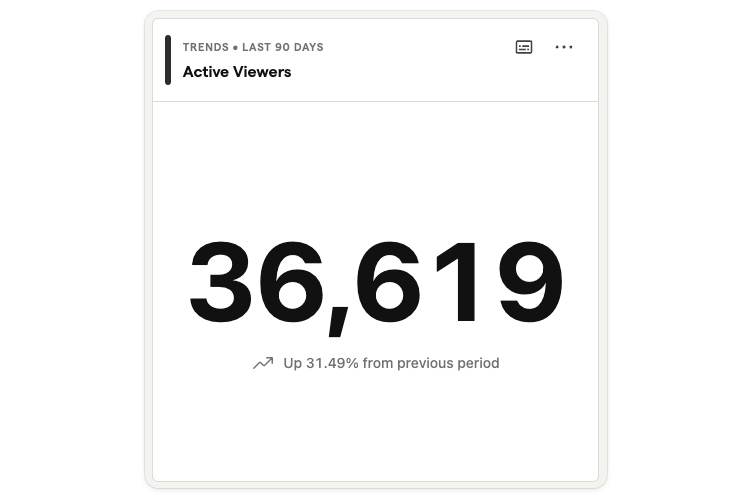
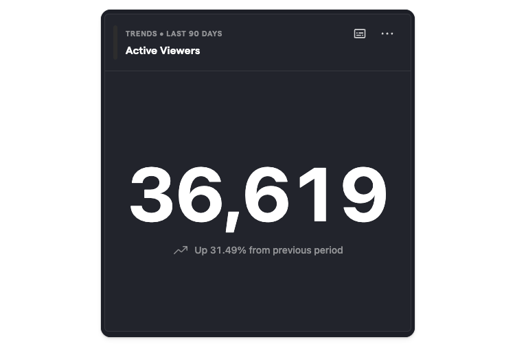
Shows the total of events or data points during the given period. Tick the "Compared to previous period" option to add a percentage comparison.
This option is only available when there's just one series (or formula and no breakdowns added to the insight.
Bar Chart
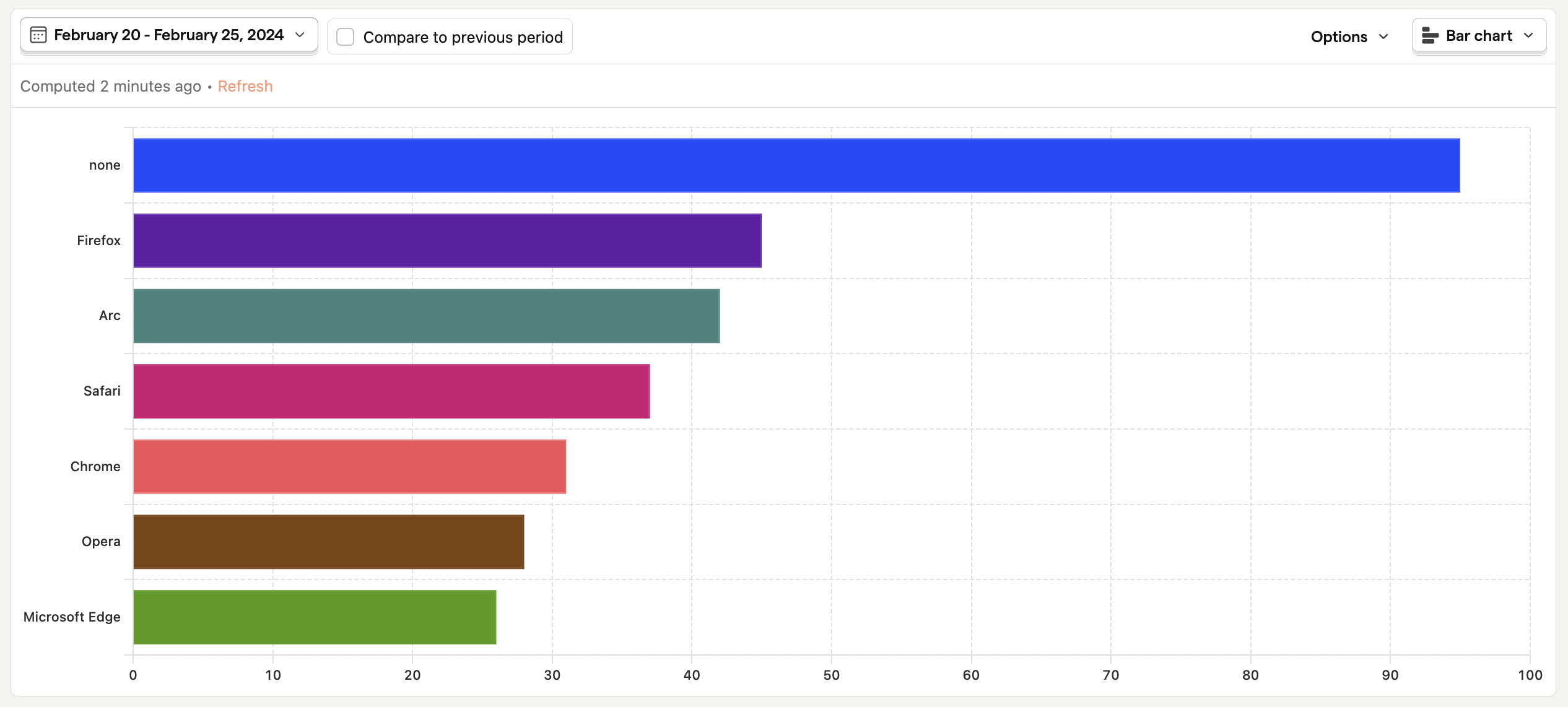
Displays the total value of a series over the entire date range. This means that this type of plot has no option for grouping, as it doesn't display data over time.
Try using a breakdown in combination with this chart type to see a list of the top property values, or add multiple series to see how they compare.
Table
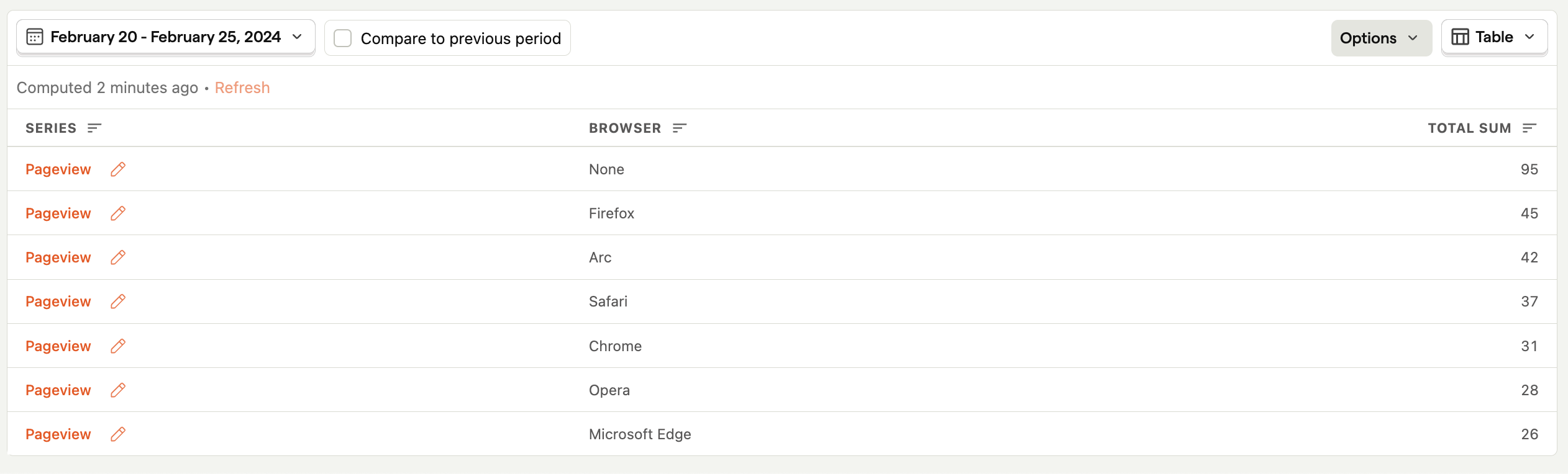
The table view displays the raw numerical values of a series over the entire date range.
Pie
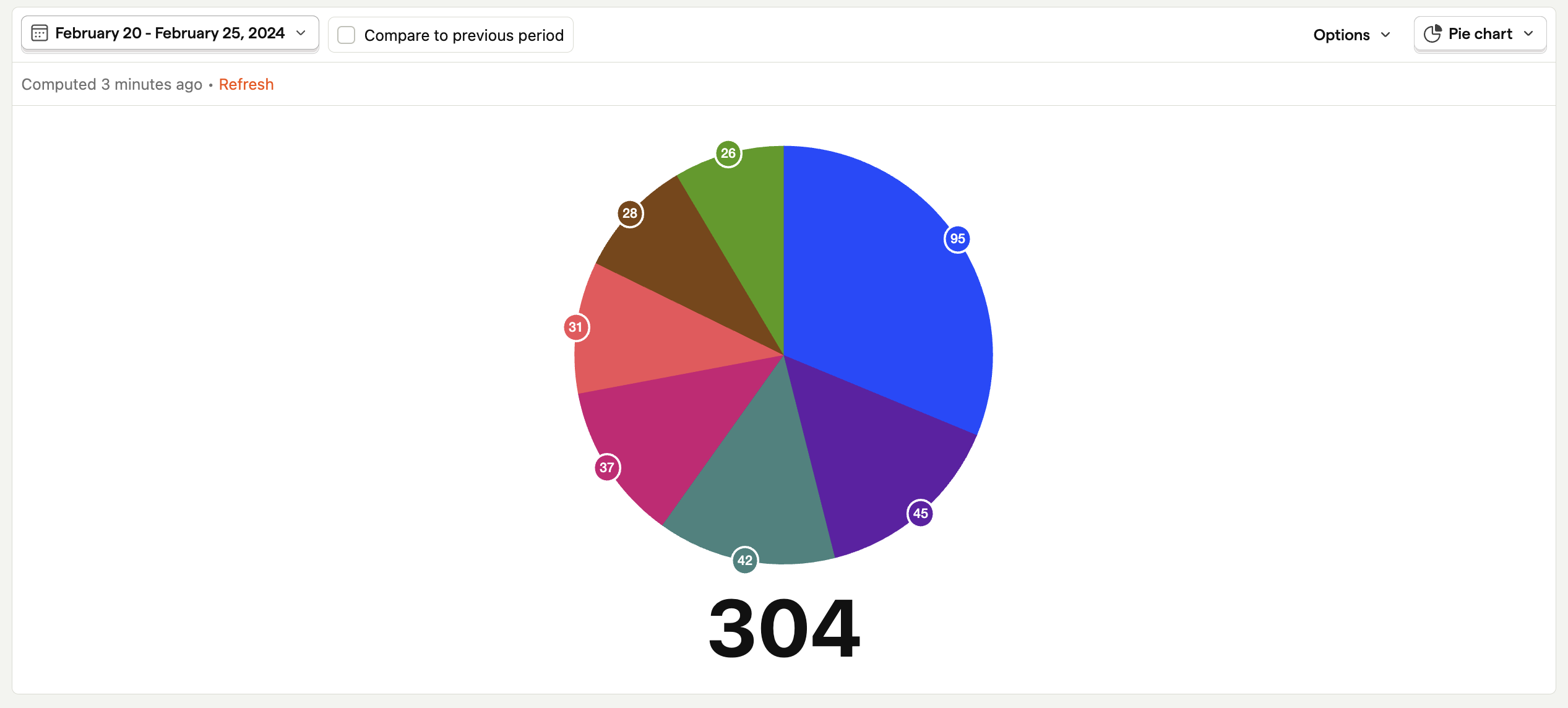
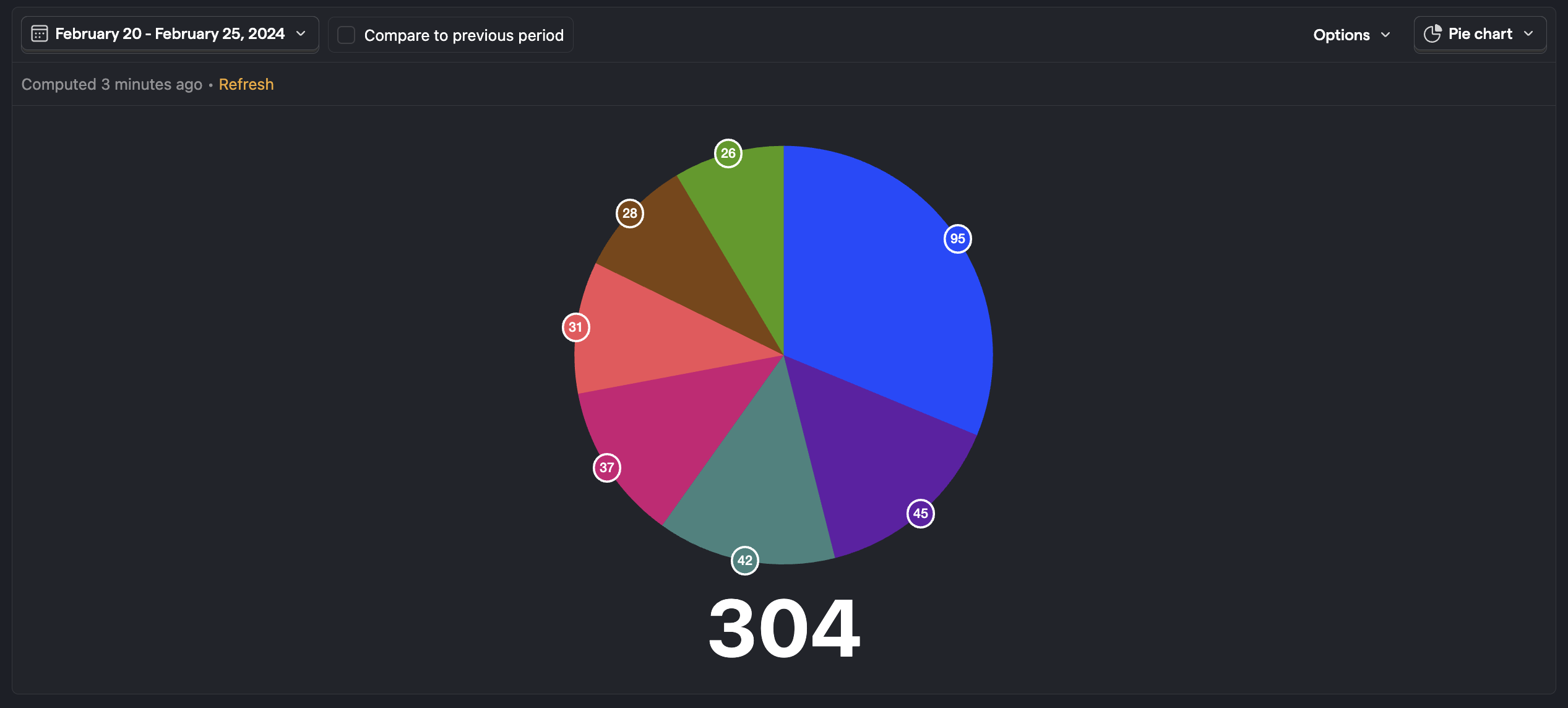
The pie chart shows the relative distribution of the values of different series or breakdowns over the entire date range.
World map
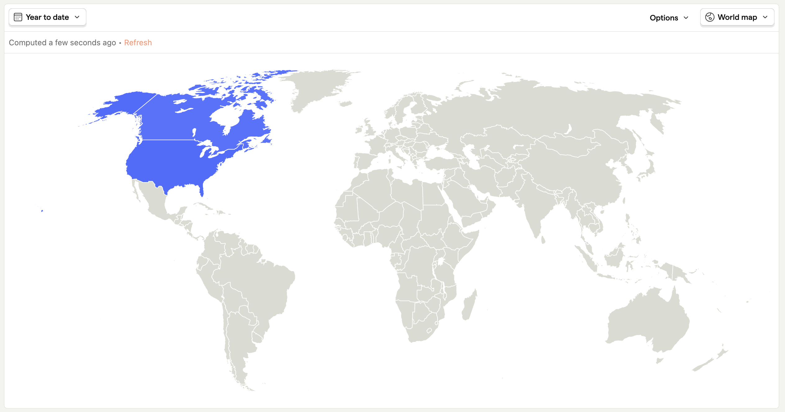
The world map chart displays values in an interactive map of the world, broken down by country code. This display option can't be selected if you're already breaking down by a property other than country code.
Calendar heatmap
Important: This feature is currently an opt-in beta. You can enable it on the feature previews settings page.
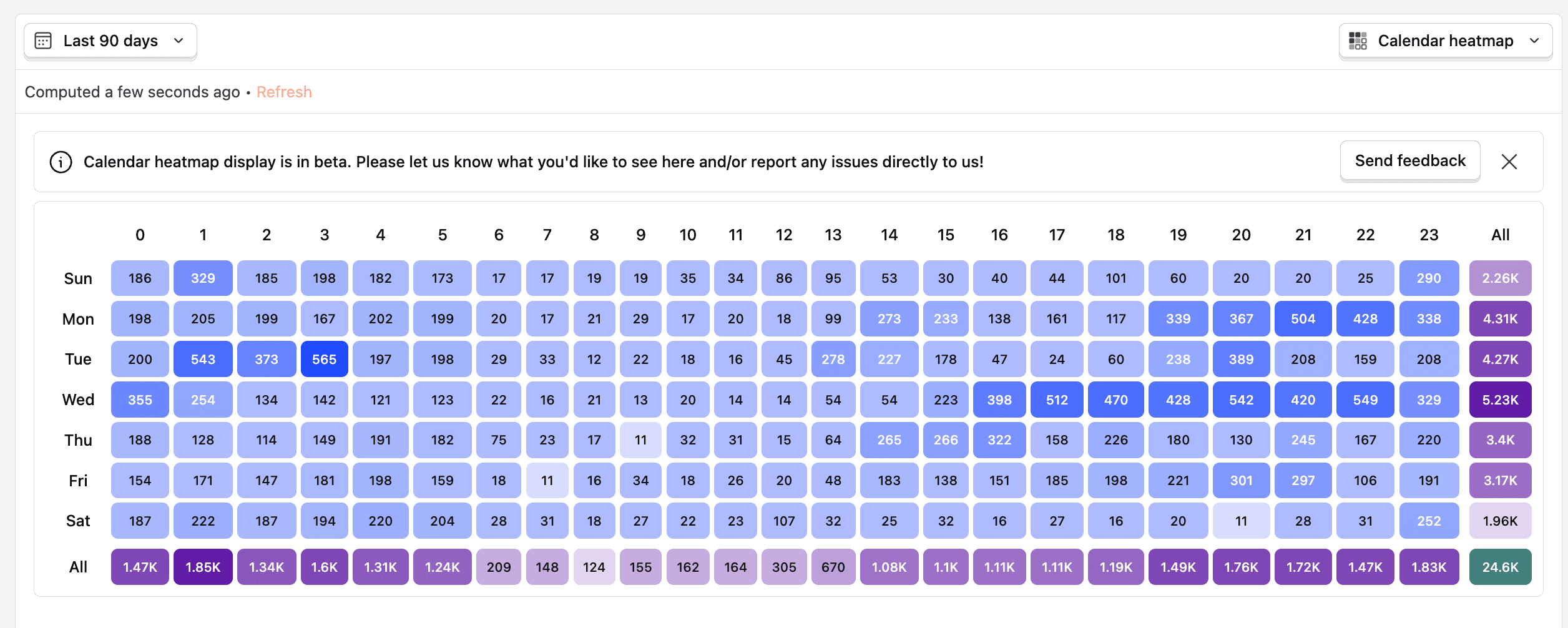
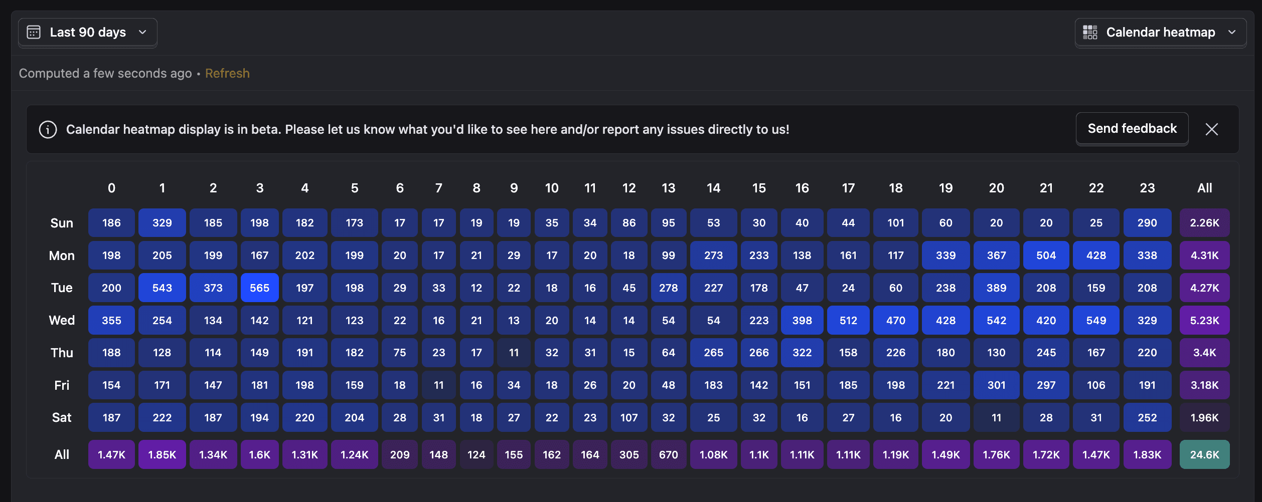
The Calendar heatmap insight displays a heatmap showing either the number of unique users or total events for any selected event, broken down by hour of the day and day of the week.
What the heatmap shows
Each cell represents the number of unique users or total events during a specific hour of a specific day. Numbers are formatted for readability (e.g., 1.73K for 1,730).
The "All" column on the right aggregates the total for each day across all hours, and is highlighted in a different color.
The bottom row ("All") aggregates the total for each hour across all days, also highlighted in a different color.
The bottom-right cell shows the grand total for the selected metric (unique users or total events) across all days and hours in the selected time range, with a distinct color.
Use the "Show more" button to expand the heatmap and view additional details if available.
The displayed time for each cell and the starting day of the week are based on your project's date and time settings. By default, the time is UTC, but you can change the timezone in your project settings.
Note: Selecting a time range longer than 7 days will include additional occurrences of weekdays and hours, potentially increasing the counts in those buckets. For best results, select 7 closed days or a multiple of 7 closed day ranges.