Trends insights enable you to plot data from people, events, and properties however you want.
They're useful for finding patterns in your data, as well as monitoring your product to ensure everything is running smoothly.
Trends is the default insight type in PostHog.
What can you learn from trends?
Using trends, you can analyze:
- How your most important metrics change over time.
- Long-term patterns, or cycles in your usage.
- How a specific change affects usage.
- The usage of different features side-by-side.
- How the properties of events vary using aggregation (sum, average, etc).
You can also visualize the same data points in a variety of ways.
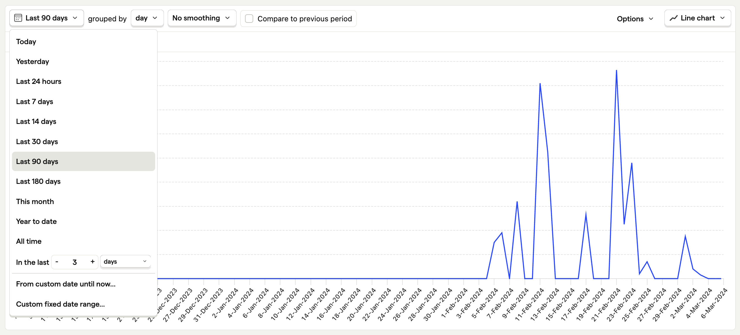
Below is the number of active viewers on Hogflix, an imaginary streaming service for hedgehogs.
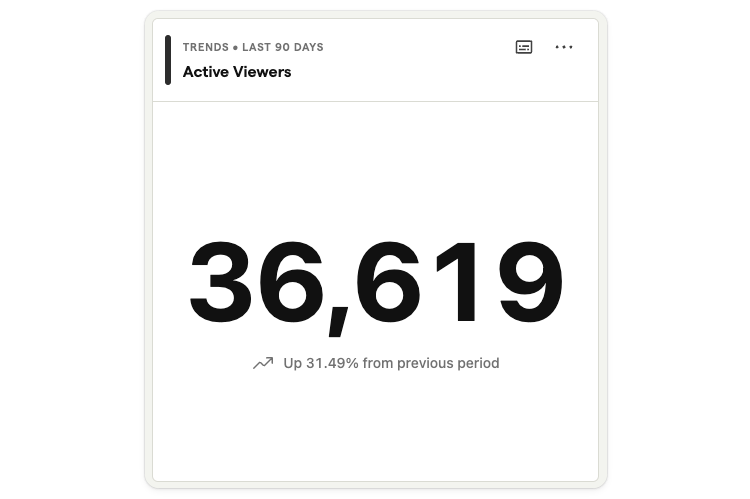
This is a number chart, which is useful for seeing the total of all events in a given period, and how it's changed compared to the previous period.
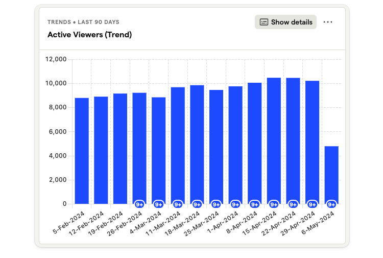
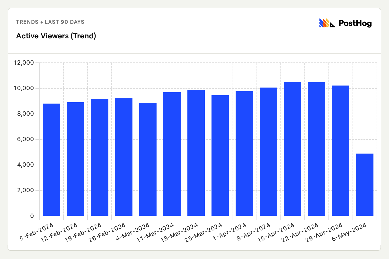
Above is the same metric, active viewers of Hogflix, over the last 90 days and grouped by week.
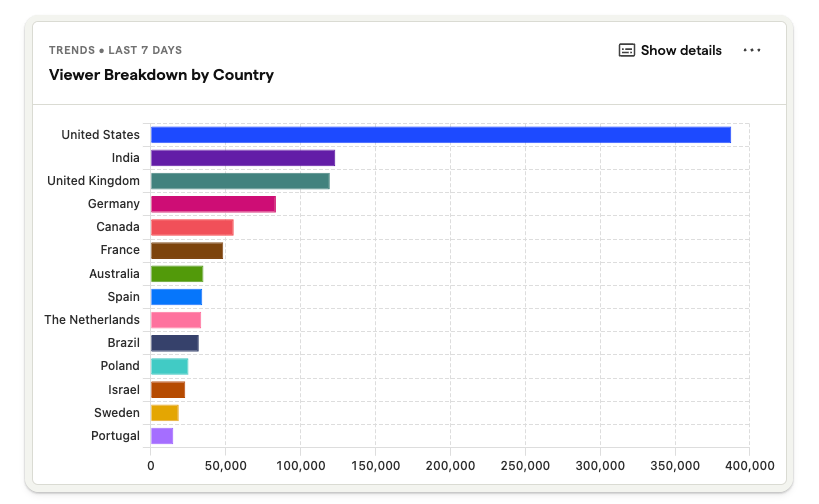
And you can break down these users by properties, like in the above bar chart that shows Hogflix viewers broken down by country.
Read the chart type docs for a summary of all supported visualizations.
Getting started
1. Creating a new trend
To create a new trends insight, navigate to the 'Product analytics' tab in the sidebar, where you can also view a list of all your saved insights.
Next, click the 'New insight' button in the top right – you can also click the + symbol next to 'Product analytics' in the sidebar.
Trends is the default insight type, so clicking 'New insight' will always create a trends insight.
2. Configuring your insight
The default event type is Pageview.
To change the event being used, click on the dropdown the dropdown to the right of the
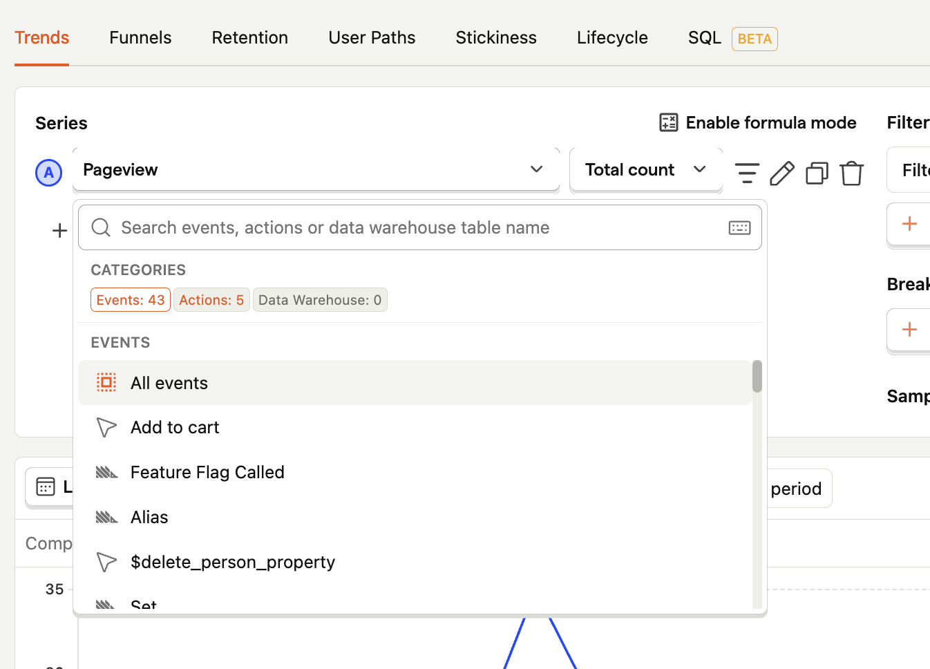
This dropdown enables you to search through all your events and actions, and pick which one you would like to plot data from.
We aggregate series by the total number (Total count) by default. Click the dropdown to choose a different metric, such as Unique users or Daily active users. See the event and property aggregation docs for a full breakdown of options.
Note: A dotted line indicated the data for that period is still being collected. If you choose a date range of the last 30 days grouped by week, for example, the week you're currently in would be dotted because the week hasn't ended yet.
3. Adding filters based on properties
It's often useful to analyze a subset of events, such as Pageview events for a specific URL, or events performed by users in a specific country. To do this, we add a property filters.
To add a filter to an event series, click on the icon next to the event name, and then click the 'Add filter' button.
This will bring up a dropdown where you can search through all event properties and choose the one you would like to filter based on.
In the above example, we've chosen the Device type event property, so that we can plot data for Desktop users only.
If we wanted to include events from Mobile users as well, we can create an additional series by clicking the icon to duplicate the existing series, then change the Device type field to Mobile.
This generates a line chart with Pageview events for Desktop and Mobile users plotted together for the last 7 days.
Click on 'Add graph series' to add more series.
Read more about filters in the filtering docs.
4. Changing the time range
The default time range is the last 7 days.
To change this, click on the drop down where it says 'Last 7 days' and select your desired date range.
You can also select how events are grouped – e.g. by hour, day, week, or month.
Smoothing, where we apply a 7-day or 28-day rolling average, is available when data is grouped by day. This is useful for eliminating excess variability in data, and identifying long-term patterns in very noisy data.
Note Setting a very long time range can severely impact query performance, especially for high-volume events. If you find it's taking too long to load, consider reducing your date range, or enabling sampling.
5. Saving and sharing your insight
We generate an insight name automatically based on your events and filters. Click the pencil icon next to the name to create your own.
You can add a description, too. Descriptions support Markdown, so you can add links, bullet points, and text formatting to add more context for other users.
Click 'Save' in the top right at any time to save your insight. Once saved, an 'Edit' button replaces it.
There are several ways to share your insight:
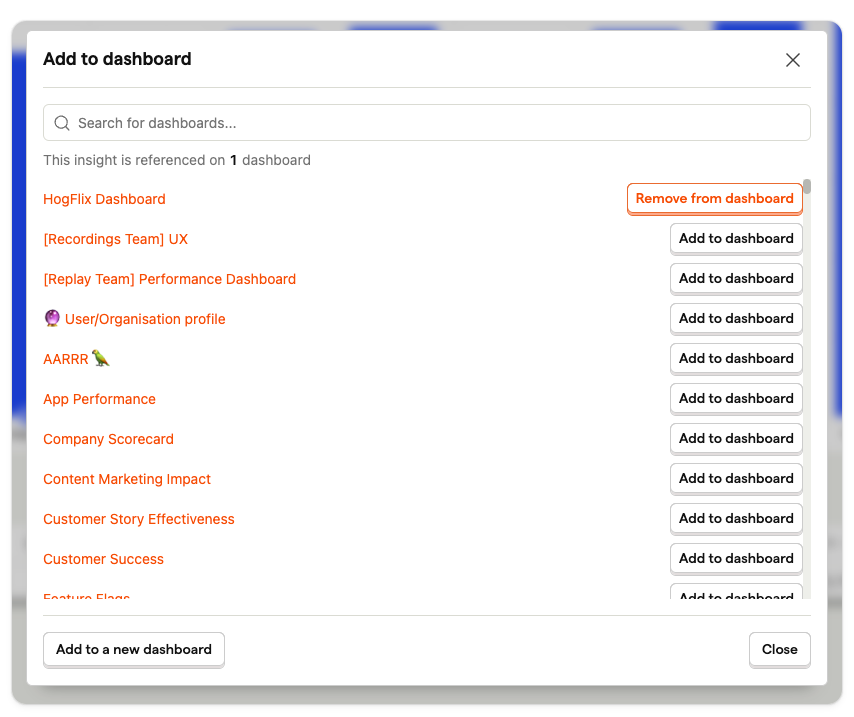
Add to dashboard
Insights can belong to multiple dashboards at once, so you don't have to create the same insight over and over again. Just click 'Add to dashboard'. After this you can see all the dashboards an insight belongs to, and navigate to them, by clicking the 'Manage dashboards'.
Add to notebook
Notebooks are a great way to do ad hoc analysis using existing insights, or by creating new insights inside a notebook.
Click 'Add to notebook' in the top right to do so. Alternatively, click on 'Notebook' in the right sidebar and then drag and drop insights from the product analytics page into a notebook.
Export or embed
Click the '...' menu on any insight to view the export and embed options.
Choose Share or embed to share a live version of your insight as an iframe.
Alternatively, go to Export and choose the PNG option to generate a PNG version of your insight that you can use anywhere, such as the one below.
Export too large? If you find that your export is slow or stalled, we recommend using our batch export feature instead.
Create a subscription
You can also create a subscription to an insight, which you can send to an email, or list of emails, or to a Slack channel.
Go to Subscribe and New subscription and choose the type of subscription you want, and the frequency.
See the subscriptions docs for a complete guide.