Recharts is a popular charting library for React. It provides many visualization and customization options to use with analytics data in PostHog.
To provide examples of what you can do with it, we create a basic React app, set it up to get data from PostHog's query API, and visualize it with Recharts.
Don't want to do all the work of querying and visualizing? You can always share or embed insights, dashboards, and more. See sharing docs for more.
Creating a basic React app
To start, we will create a basic React app using Vite.
Once created, go into the folder, install the dependencies, and start the dev server.
Terminal
cd rechart-ph
npminstall
npm run dev
This gives us a basic React app we can add our example visualizations to.
Querying data from PostHog
Assuming you have data in PostHog to query, the next step is to set up our query request to PostHog.
Don't have data to query? Check out our guide to setting up analytics in React to start capturing some. Unlike other tutorials, we aren't going to install PostHog in this one.
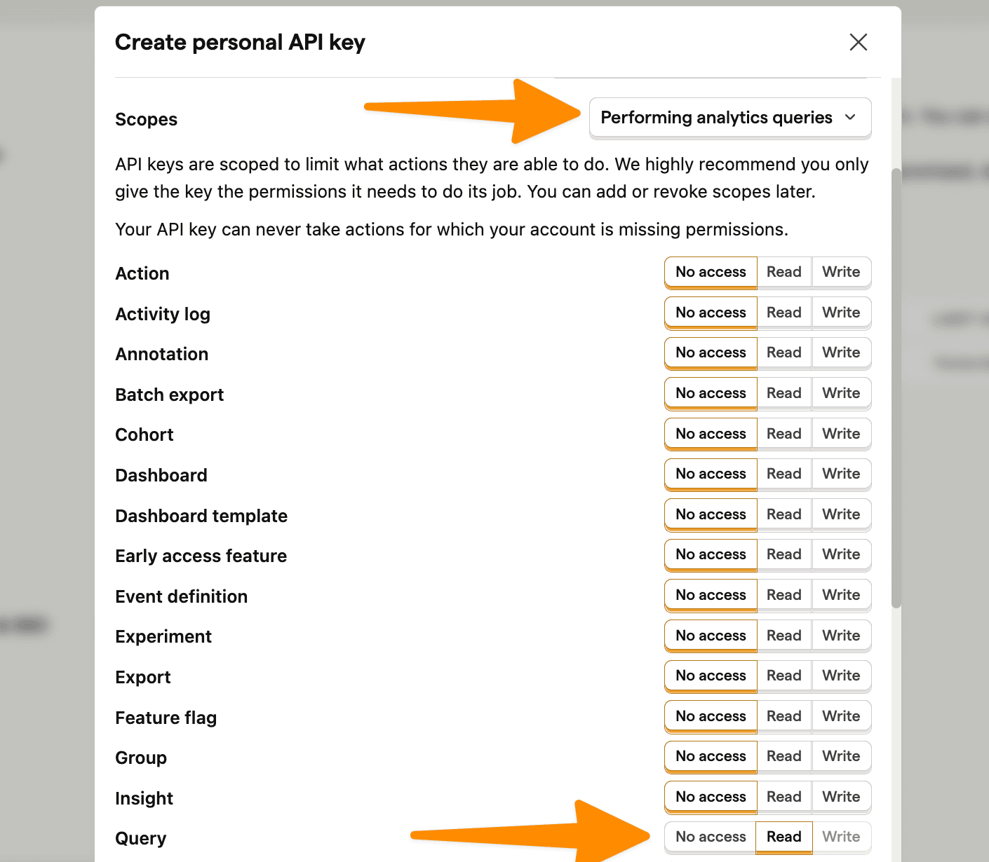
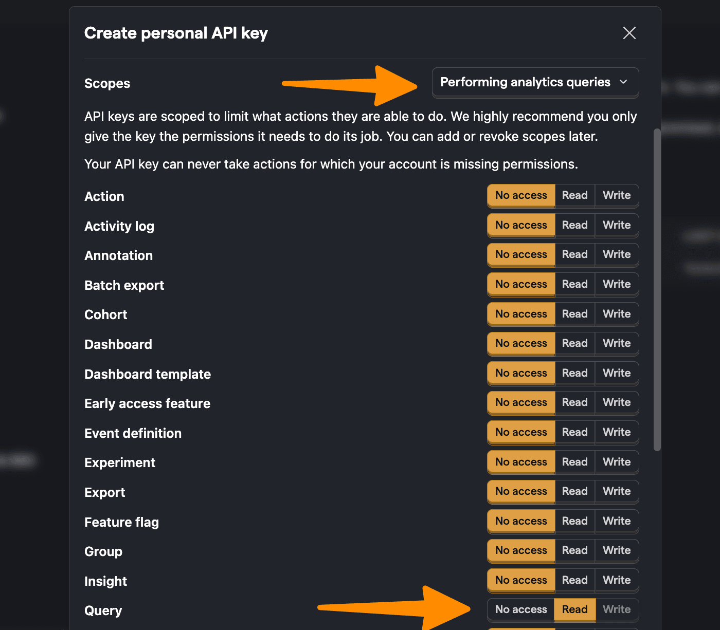
Start by creating a personal API key. You can do this by going to personal API keys in your project settings, clicking Create personal API key, giving it a label, choosing the Performing analytics queries scope (AKA query read), and clicking Create key.
⚠️ Warning: The following is a simplified example. Exposing your personal API key (like we do below) exposes your private PostHog data to the public internet, so don't do this in real life. Make sure your personal API key isn't exposed and your query request happens securely on the server side.
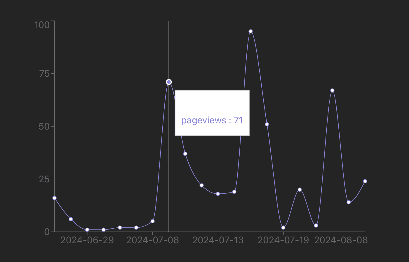
With this personal API key, we can set up a request in our React app to PostHog's query API endpoint using your project ID. We use SQL in the payload to get the data we want and display it unformatted in our app for now:
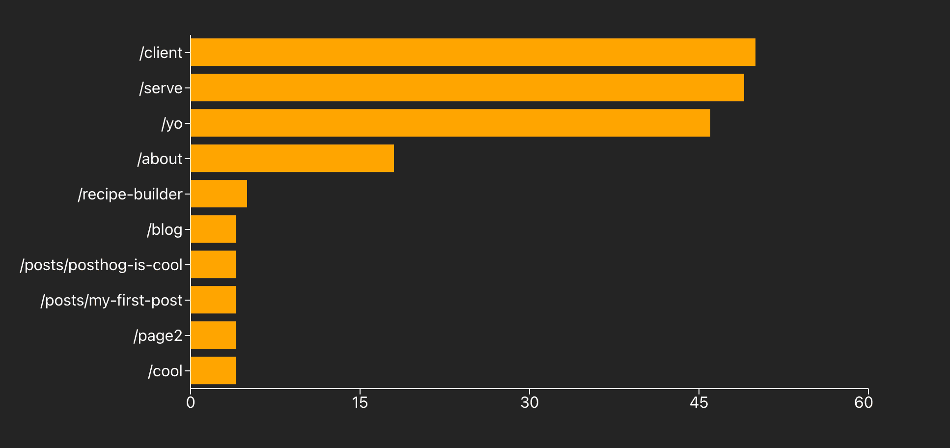
We can write a similar query to get the top paths by a count of pageviews. We basically swap in properties.$pathname AKA pathname, filter out null values, and order by the pageview_count.
The challenge is getting all this data to fit. To do this, we set the Rechart BarChart component to the vertical layout and increase the width of both the whole component and the YAxis. On top of this, we change the colors to make it stand out.
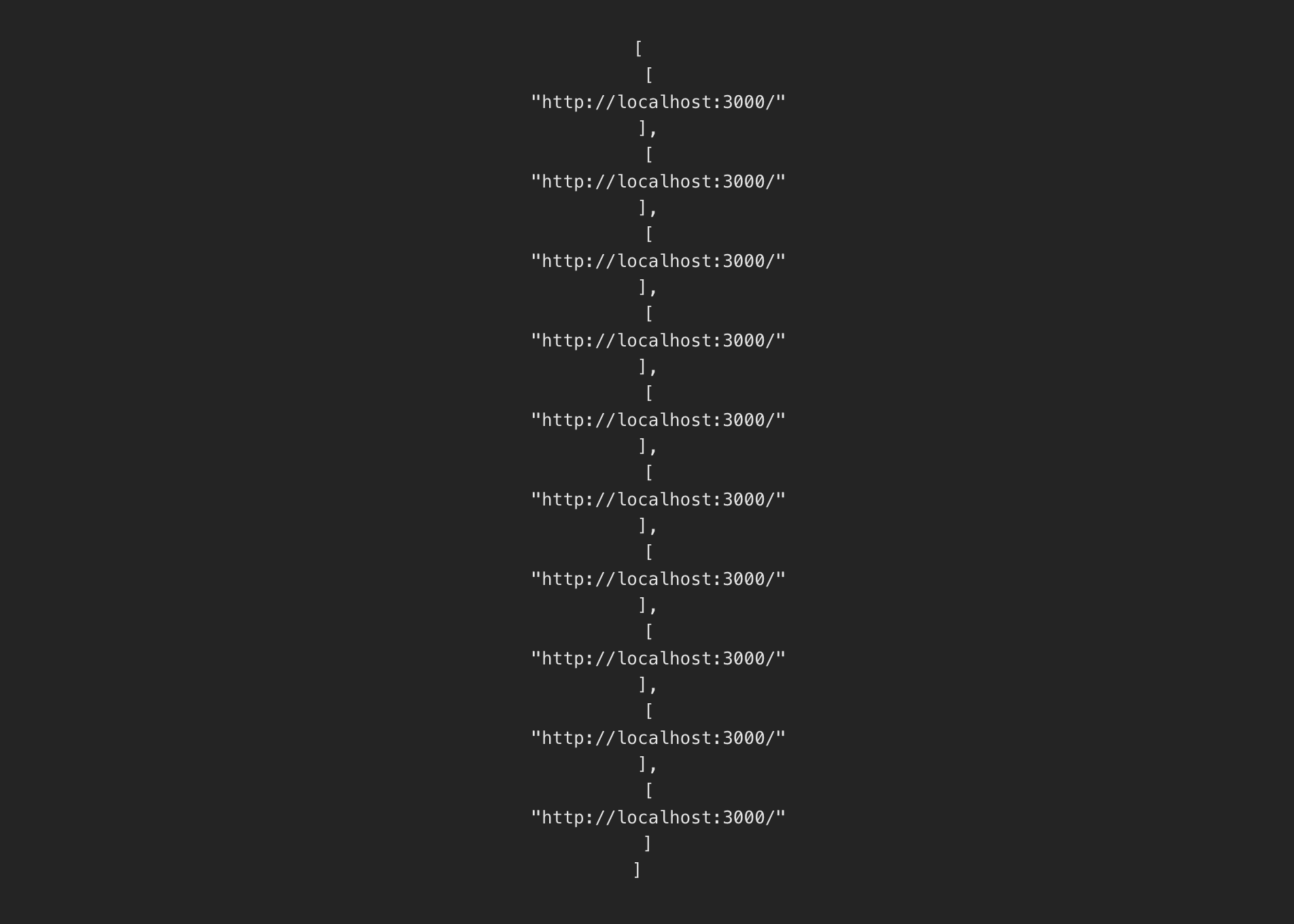
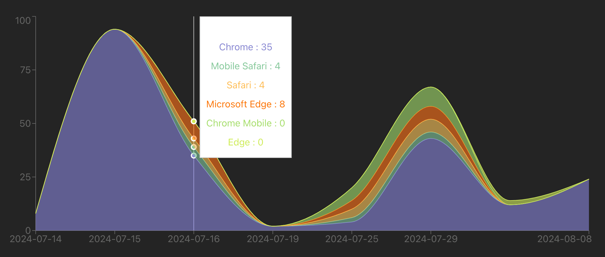
We can do a more complicated visualization of pageviews by browser. The tricky part is formatting the data to work with the visualization. The input data from PostHog looks like this:
JavaScript
[
['2023-05-01','Chrome',100],
['2023-05-01','Firefox',50],
['2023-05-02','Chrome',120],
]
The data we want for the visualization looks like this:
JavaScript
[
{date:'2023-05-01',Chrome:100,Firefox:50},
{date:'2023-05-02',Chrome:120,Firefox:0}
]
This means we must loop through the data, create entries for each date, and add pageviews for each browser to the date entry. Once formatted, we can use the AreaChart to visualize it. Together, this looks like this:
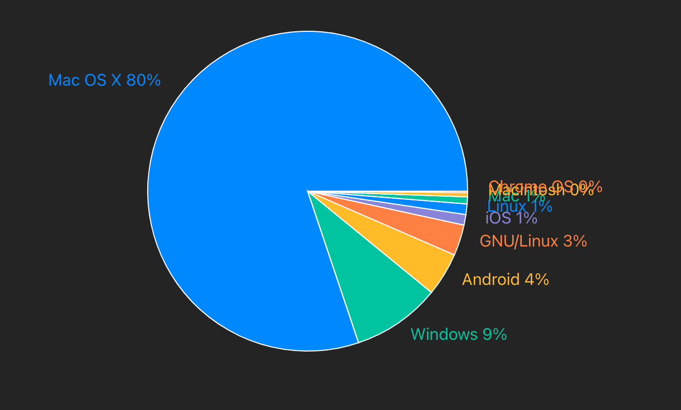
The last visualization we can set up is a pie chart of operating systems. We can get the data by getting a count of $pageview events by properties.$os. We then format this data and set up custom labels and colors for the pie chart.