How to use React Charts to visualize analytics data (with examples)

Sep 12, 2024

React Charts is a popular visualization and charting library for React. It provides a simplified set of performant charts to use with analytics data from PostHog.

To provide examples of what you can do with it, we create a basic Next.js app, set it up to fetch data from PostHog's query API, and visualize it with React Charts.

Don't want to do all the work of querying and visualizing? You can always share or embed insights, dashboards, and more. See sharing docs for more.

Creating a Next.js app

To create a Next.js app, run the following command, choose all the default options, and select the app router.

Terminal
npx create-next-app@latest react-charts-example

This creates a react-charts-example folder with everything we need to get started.

Querying data from PostHog

Assuming you have data in PostHog to query, the next step is to set up our query request to PostHog.

Don't have data to query? Check out our guide to setting up analytics in Next.js to start capturing some.

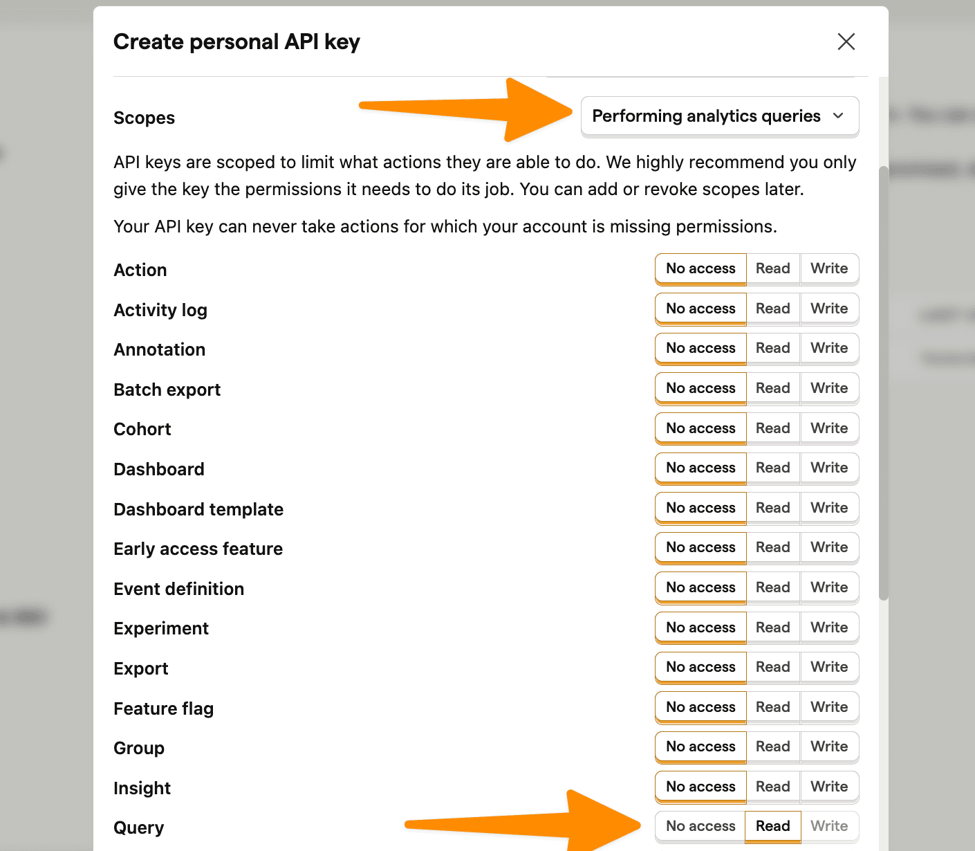
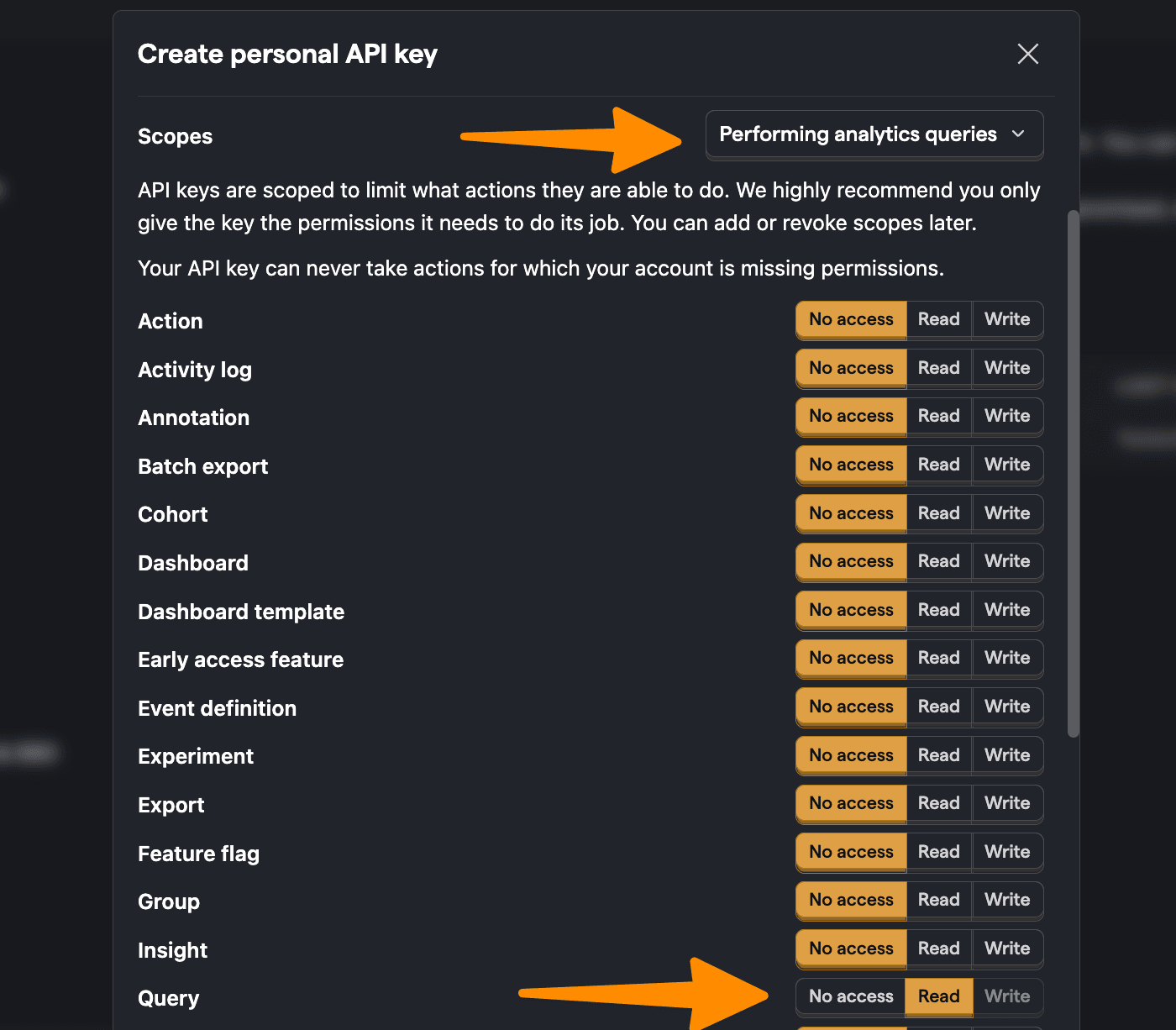
Start by creating a personal API key. You can do this by going to personal API keys in your project settings, clicking Create personal API key, giving it a label, choosing the Performing analytics queries scope (AKA query read), and clicking Create key.

Creating a personal API key in PostHog

⚠️ Warning: The following is a simplified example. Exposing your personal API key or an endpoint that accepts arbitrary queries (like we do below) exposes your private PostHog data to the public internet, so don't do this in real life. Make sure your personal API key isn't exposed and your query request happens securely on the server side.

Next, go into your react-charts-example folder, then the app folder, and create an api folder. In the api folder, create a query.js file. Here we set up a fetch request to PostHog's query API endpoint using your project ID (from your PostHog URL) and personal API key like this:

app/api/query.js
export const fetchQuery = async (payload) => {
const projectId = "12345"; // e.g. if your PostHog dashboard URL is https://us.posthog.com/project/12345
const apiKey = "<your_personal_api_key>";
try {
const response = await fetch(`https://us.posthog.com/api/projects/${projectId}/query/`, {
method: "POST",
headers: {
"Content-Type": "application/json",
"Authorization": `Bearer ${apiKey}`
},
body: JSON.stringify(payload),
});
const data = await response.json();
return data;
} catch (error) {
console.error("Error fetching data:", error);
throw error;
}
}

Finally, in our client component, we make the query request using HogQL and display the data:

JavaScript
// app/page.js
'use client'
import { useState, useEffect } from 'react'
import { fetchQuery } from './query'
export default function Home() {
const [data, setData] = useState([])
const fetchData = async () => {
const payload = {
"query": {
"kind": "HogQLQuery",
"query": "select properties.$current_url from events where properties.$current_url != null limit 10"
}
}
try {
const result = await fetchQuery(payload);
setData(result.results);
} catch (error) {
console.error("Error fetching data:", error);
}
}
useEffect(() => {
fetchData();
}, []);
return (
<main>
<pre>{JSON.stringify(data, null, 2)}</pre>
</main>
)
}

The page we end up with is an ugly collection of non-aggregated data, but we'll fix that next.

Ugly data

Visualizing data with React Charts

With our app and query request set up, it's time to set up the visualization. To start, we install react-charts:

Terminal
npm install react-charts

Once done, we can import the necessary components, format the data for React Charts, and set up the axes for the visualization. Some useful queries and visualizations include:

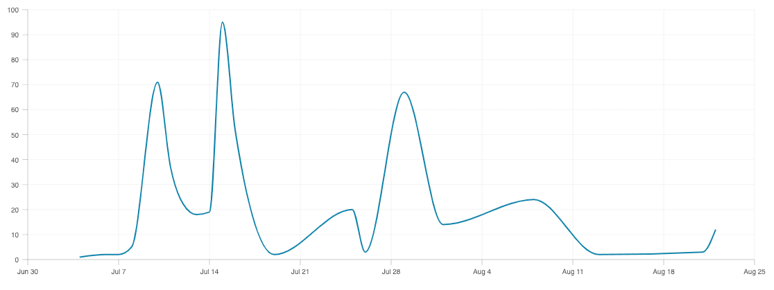
Line chart of pageviews by day

A basic query to start with is getting the count of $pageview events by day. To do this, we:

  1. Write a query to select the date and count() of $pageview events grouped and ordered by date.
  2. Change the format of the data from the array PostHog provides the object React Charts expects.
  3. Set up the primaryAxis and secondaryAxes for the data.
  4. Import and use the Chart component to visualize it.

Altogether, this looks like this:

JavaScript
'use client'
import { useState, useEffect, useMemo } from 'react'
import { fetchQuery } from './query'
import { Chart } from 'react-charts'
export default function Home() {
const [data, setData] = useState([])
const fetchData = async () => {
const payload = {
"query": {
"kind": "HogQLQuery",
"query": `SELECT
toDate(timestamp) AS date,
count() AS pageview_count
FROM events
WHERE event = '$pageview'
GROUP BY date
ORDER BY date DESC
LIMIT 20`
}
}
try {
const result = await fetchQuery(payload);
const formattedData = result.results.map(([date, count]) => ({
date: new Date(date),
pageview_count: count
}));
const dataWithLabel = {
label: 'Pageviews',
data: formattedData
}
setData(dataWithLabel);
} catch (error) {
console.error("Error fetching data:", error);
}
}
useEffect(() => {
fetchData();
}, []);
const primaryAxis = useMemo(
() => ({
getValue: datum => datum.date,
}),
[]
)
const secondaryAxes = useMemo(
() => [{
getValue: datum => datum.pageview_count,
}],
[]
)
return (
<main style={{ width: '100%', height: '400px' }}>
{data.data?.length > 0 ? (
<Chart
options={{
data: [data],
primaryAxis,
secondaryAxes
}}
/>
) : (
<p>Loading...</p>
)}
</main>
)
}

This provides us with a nice visual of pageviews by day.
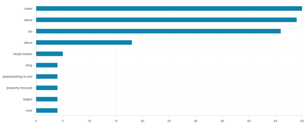
Trend of pageviews by day

We can write a similar query to get the top paths by a count of pageviews. We swap in properties.$pathname AKA pathname, filter out null values, and order by the pageview_count. We also reverse the order of the results so the largest count is at the top.

To get all this data to fit, we use a horizontal bar chart. This requires changing our query, data formatting, and axes. This complete component looks like this:

JavaScript
//... use client, imports
export default function Home() {
const [data, setData] = useState([])
const fetchData = async () => {
const payload = {
"query": {
"kind": "HogQLQuery",
"query": `SELECT
properties.$pathname AS pathname,
count() AS pageview_count
FROM events
WHERE
event = '$pageview'
AND properties.$pathname IS NOT NULL
AND properties.$pathname != '/'
GROUP BY pathname
ORDER BY pageview_count DESC
LIMIT 10`
}
}
try {
const result = await fetchQuery(payload);
const formattedData = result.results.map(([pathname, count]) => ({
pathname,
pageviews: count
}));
const dataWithLabel = {
label: 'Pageviews',
data: formattedData
}
setData(dataWithLabel);
} catch (error) {
console.error("Error fetching data:", error);
}
}
useEffect(() => {
fetchData();
}, []);
const primaryAxis = useMemo(
() => ({
position: 'left',
getValue: datum => datum.pathname,
}),
[]
)
const secondaryAxes = useMemo(
() => [{
position: 'bottom',
getValue: datum => datum.pageviews,
}],
[]
)
return (
<main style={{ width: '100%', height: '400px' }}>
{data.data?.length > 0 ? (
<Chart
options={{
data: [data],
primaryAxis,
secondaryAxes
}}
/>
) : (
<p>Loading...</p>
)}
</main>
)
}

This creates a bar chart that looks like this:

Bar chart

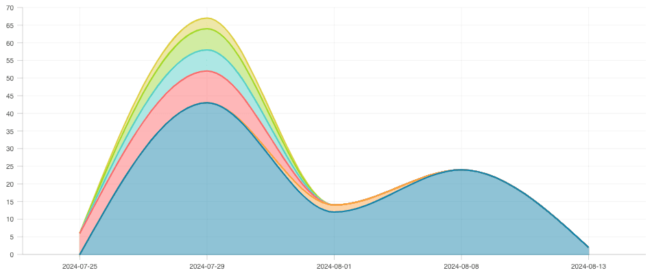
Stacked area of browsers

We can do a more complicated visualization of pageviews by browser. The tricky part is formatting the data to work with the visualization. The query data from PostHog looks like this:

JavaScript
[
['2023-05-01', 'Chrome', 100],
['2023-05-01', 'Firefox', 50],
['2023-05-02', 'Chrome', 120],
]

The data we want for the visualization looks like this:

JavaScript
[
{
"label": "Chrome",
"data": [
{
"date": "2023-05-01",
"pageviews": 100
},
{
"date": "2023-05-02",
"pageviews": 120
}
]
},
{
"label": "Firefox",
"data": [
{
"date": "2023-05-01",
"pageviews": 50
},
{
"date": "2023-05-02",
"pageviews": 0
}
]
},
]

Making this translation requires the following:

  1. Getting all the unique dates and browsers from the query results.
  2. Creating a map with all the dates and browsers with the pageviews set to zero.
  3. Looping through the results to fill the actual pageview counts.
  4. Converting the map to the required format.

Once done, there are some slight tweaks required to display it, such as using the area elementType. Together, this looks like this:

JavaScript
//... use client, imports
export default function Home() {
const [data, setData] = useState([])
const fetchData = async () => {
const payload = {
"query": {
"kind": "HogQLQuery",
"query": `SELECT
toDate(timestamp) AS date,
properties.$browser AS browser,
count() AS pageview_count
FROM events
WHERE event = '$pageview' AND properties.$browser IS NOT NULL
GROUP BY date, browser
ORDER BY date DESC, pageview_count DESC
LIMIT 10`
}
}
try {
const result = await fetchQuery(payload);
// Get all unique dates and browsers
const allDates = [...new Set(result.results.map(([date]) => date))].reverse();
const allBrowsers = [...new Set(result.results.map(([, browser]) => browser))];
// Create a map with all dates and browsers and set pageviews to 0
const dataMap = new Map();
allDates.forEach(date => {
allBrowsers.forEach(browser => {
if (!dataMap.has(browser)) {
dataMap.set(browser, new Map());
}
dataMap.get(browser).set(date, 0);
});
});
// Fill in the actual pageview counts
result.results.forEach(([date, browser, count]) => {
dataMap.get(browser).set(date, count);
});
// Convert the map to the required format
const formattedData = Array.from(dataMap, ([browser, dateMap]) => ({
label: browser,
data: Array.from(dateMap, ([date, pageviews]) => ({ date, pageviews }))
}));
setData(formattedData);
} catch (error) {
console.error("Error fetching data:", error);
}
}
useEffect(() => {
fetchData();
}, []);
const primaryAxis = useMemo(
() => ({
getValue: datum => datum.date,
}),
[]
)
const secondaryAxes = useMemo(
() => [{
getValue: datum => datum.pageviews,
elementType: 'area'
}],
[]
)
return (
<main style={{ width: '100%', height: '400px' }}>
{data && data.length > 0 ? (
<Chart
options={{
data: data,
primaryAxis,
secondaryAxes
}}
/>
) : (
<p>Loading...</p>
)}
</main>
)
}

This creates a stacked area chart like this:

Stacked area chart

Further reading

Comments