


How we designed the PostHog mascot

Contents
Creating mascots goes beyond just putting iPencil to iPad. It’s a long, confusing, and sometimes frustrating process which requires a lot of patience and tolerance for drawing hedgehogs 12 hours a day.
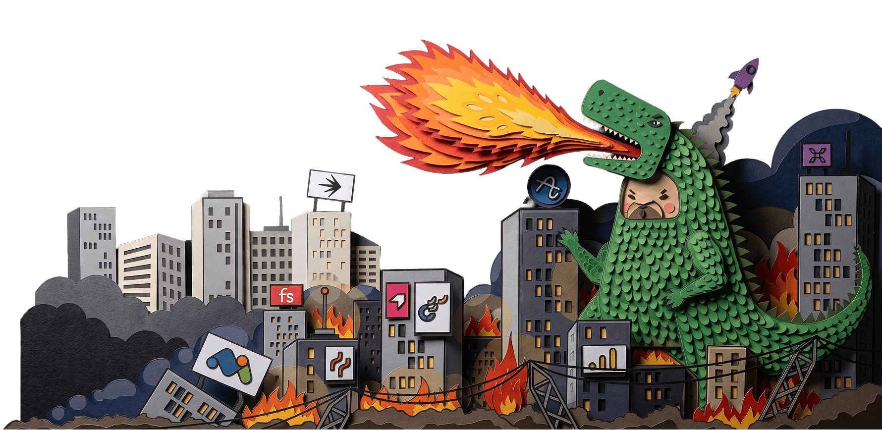
A successful mascot should go beyond representing what a company does. It should build and strengthen a brand's identity by representing its tone of voice and overall vibe. Think about GitHub's octocat mascot, which is now a familiar figure in memes, merch, and even statues.

Think before you ink
When I set out to design PostHog's mascot, it felt like there was an ocean of possibility. I'll admit I've chased ideas in the past simply because they were cool or aesthetically pleasing, but this can be dangerous. So, I took the time to think and reflect before diving into the creative process. I've learned that taking the time to consider what your company stands for and who it is selling to helps massively later in the process.
For example, last year I chased a 'tech-head' visual involving human mascots with old Acorn computers for their heads. Aesthetically it looked modern and surrealist, but it was also subliminally suggesting that PostHog was outdated and inhuman - not what you want for a forward thinking tech startup.
Eventually I realized my error and iterated towards something better - but please, learn from my mistake and avoid such confused fumblings.
Do market research
I find that some good old market research is the perfect spring board for ideas, and that looking at companies with similar values can be especially rewarding.
When creating PostHog's mascot, I took inspiration from companies such as Sentry and Hasura, both of which balance a very technical product with colourful and friendly mascots. They strike the perfect balance between playful and modern styles which allows the user to feel at ease.
Both Sentry and Hasura also use their logos as inspiration for their mascots. From here, it was obvious to me which direction to go in and that the hedgehog must be brought back.
Origins of a hedgehog
In the early days of PostHog we often debated whether the hedgehog should be a main character for our brand or if it would be too distracting. Since then, we've jumped from the original 'hairy thumb' logo designed by our founder and CEO, James, to focusing on 80s pixel art, to space and rockets and back to hedgehogs.
It’s been a process, to say the least, but an informative one. We never should have strayed from our first and one true love: the hedgehog.
The hard part, of course, is actually designing the hedgehog. This is no easy feat, but the secret is the same as most things at PostHog: focus on iteration and experimentation.
My process is as follows:
- Don’t think too much, just draw
- Draw a lot and be willing to make mistakes
- Try things you think you won’t like (if its awful, at least you’ve ruled it out)
- Don’t copy from others. You may think this will allow you to improve, but people will see through it. Originality makes you great.
Use a tablet
Personally, I use a tablet to aid me in the drawing process. Maybe I'm biased or maybe I’m wise but there is nothing more satisfying than being able to press undo instead of starting again on paper - though I've been known to try to pinch zoom on real-life paper.
Using a tablet also lets me share unfinished ideas quickly, so I can expand on them later. I use [ProCreate] or [Fresco], both of which allow for realistic drawing with a wide range of pencils, pens, and even paint.
What really sets digital drawing apart from traditional design practice is that it comes with layers. Layers change lives. Long gone are the days of linear painting - now I can select a layer and work in isolation on that, or cut out a small section and reuse it later (because I love to recycle). It has sped up my work while giving me so much freedom to work with my creations. Would 10/10 recommend to a friend.
![]()
This was our initial logo, made by our CEO James. Since this humble beginning the hedgehog has had many faces, some of which were better than others.
![]()
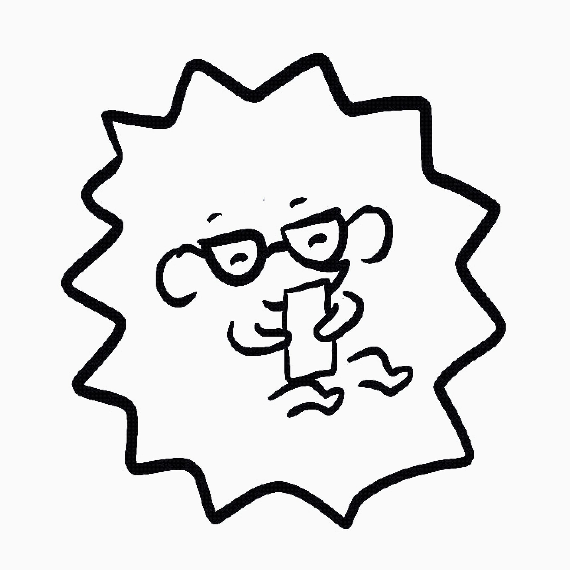
Take this square, dead-eyed creature, for example. To be honest I quite liked him and felt he gave off a quirky vibe. But he lacked character, and he had a cold, hard stare, which when looking back onto the brief it wasn’t what we wanted.
Injecting a bit more character into the mix, I created this fella. He gave off a happier, friendlier vibe - maybe because he can’t see and wears glasses. This was progress. But something didn’t quite feel right. He felt old and out of touch - once again I found myself not quite sending the right message. It was time for something different.

Next, I dabbled in 3D. I created a hedgehog in Blender to break the mould of what a mascot could look like - but this backfired and the little guy just felt cold and robotic. I was chasing something warmer, with character, something friendly. Something like...
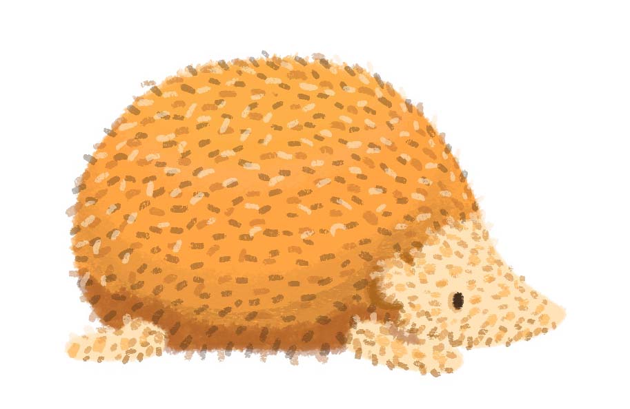
This guy, with his texture and silly, frumpy round body, just makes me happy. He reminds me of the kawaii character Gudetama, except this hog doesn't have his bum out.

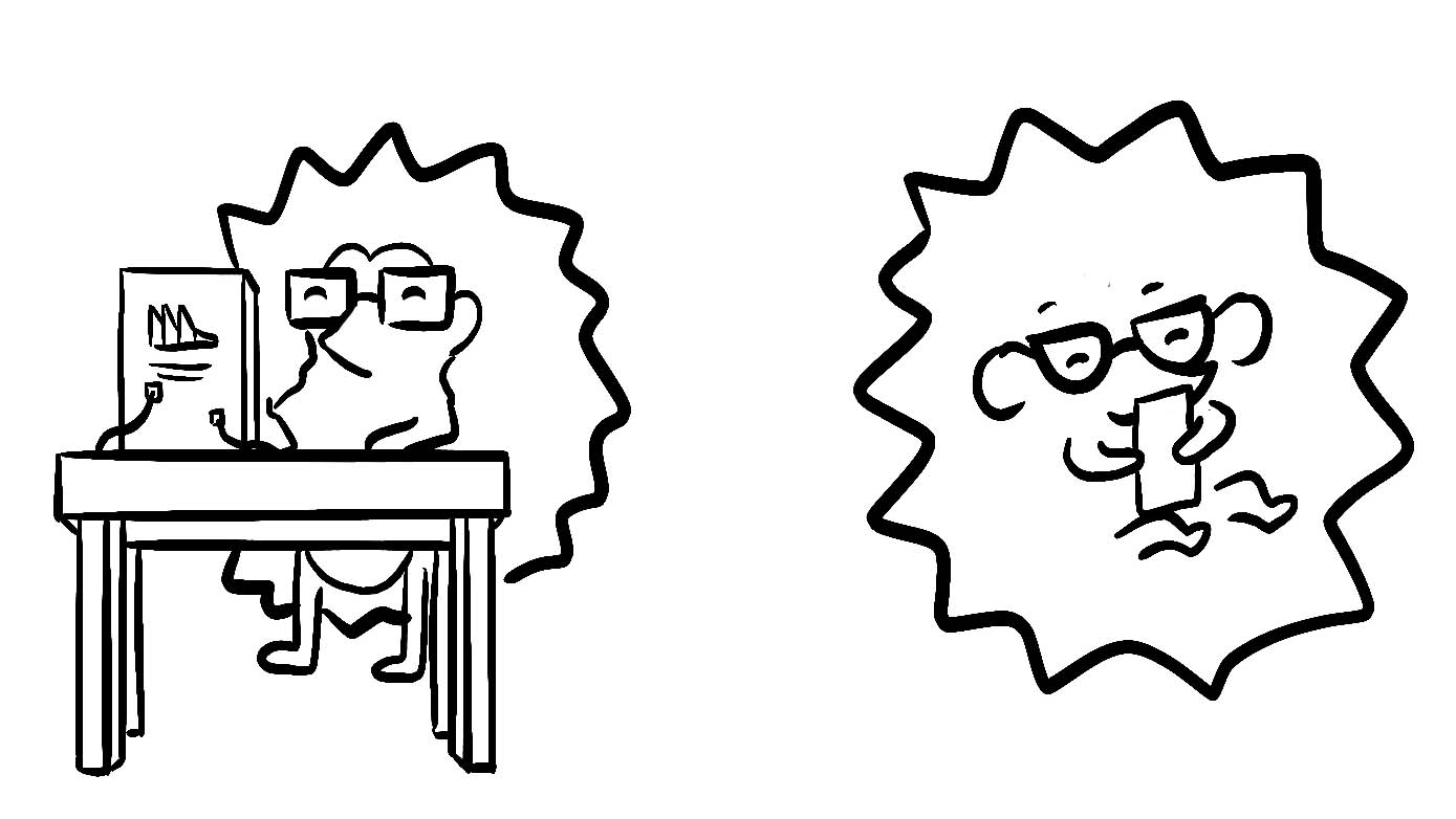
I liked the idea of this hedgehog as a relatable character, who sits at his desk tapping away at keys just like us. I think that is key for a successful mascot,; something the team can get behind.
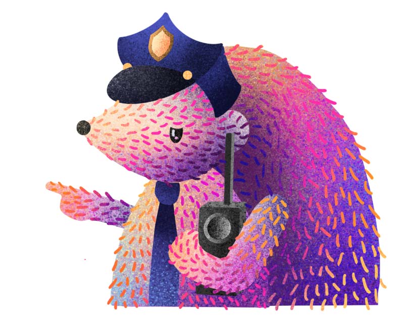
From here the character grew and grew, taking up new hobbies and professions, such as the police hog, who stops our users making mistakes when filling in forms. Helpful, yet stern.
As you can see, the hedgehog went through about 18 different variations before I knew which one suited the brand best - including large, small, angry, 3D and even square versions.
You need to test different versions to find what works - but even after finding that golden hog you still need to iterate to strengthen that brand identity.

Subscribe to our newsletter
build mode
Read by 75,000+ founders and builders
We'll share your email with Substack
PostHog is the leading platform for building self-driving products. With a full suite of developer tools – AI observability, product analytics, session replay, feature flags, experiments, error tracking, logs, and more – PostHog captures all the context agents need to diagnose problems, uncover opportunities, and ship fixes. A data warehouse and CDP tie it all together, unifying that context into one source agents can read across. You can steer it all from Slack, the web app, the desktop (PostHog Code), or your own editor via the MCP.