The magic of a Hacker News Pre-Mortem
Contents
Imagine you're working on something for other developers that you really, really want to be great.
Perhaps you're creating a new startup, perhaps you're creating a blog post, or perhaps you're working on a side project that you want to share with the world.
Enter, the Hacker News Pre-Mortem.
Hacker News is a place for developers to discuss tech news - it's a list of interesting links, each with discussion. Getting to the front page is one of the most awesome but terrifying things that can happen to a developer focused startup.
The New Yorker sums it up better than I can:
"readers who visit the site to learn how engineers and entrepreneurs talk, and what they talk about, can find themselves immersed in conversations that resemble the output of duelling Markov bots trained on libertarian economics blogs"
A Hacker News Pre-Mortem is a term I just made it up, for when you do your best to preempt the criticism your thing could get if it got to the front page of Hacker News.
This is not a 'how to go viral' guide. If you want to do that, ironically don't focus on it. Instead, create unusually helpful content and share it. I mainly write about topics other founders ask me, or interesting things I observe first hand about our company), since I am in a unique position to write about those topics.
We've had our repo, side projects and several blog posts all get to the front page.
So, what are the basic criticisms that come up over and over for projects posted there?
I can't tell from your website what this does
Conventional marketing lore states "features tell, benefits sell".
This has created the rise of "marketing websites" (please treat it like a product instead) that use vague, high level benefit/marketing oriented language with no product details, and my personal least favorite - pricing pages without pricing information.
This is particularly frustrating for developers, who are often involved in figuring out if a product can be setup and integrated properly, and moreover, for anyone trying to compare products. Alas, tech vendor, the world doesn't revolve around you.
Example 1 | Example 2 | Example 3 | Example 4 | Example 5 | Example 6
I wouldn't use this
The opposite criticism to the above. This reader gets what it is, but they don't understand why it's useful. Maybe you went too far just listing out technical specs.
There should be some supporting positioning that explains why someone may want to use your product, but this should be feel secondary to short explanations of what it does.
Or, maybe you're just wrong. People don't agree with your reasoning why they should use your thing!
If this is universal feedback, you don't have product market fit. If it's from time to time, factor this into your Ideal Customer Profile (see ours for reference).
Example | Example 2 | Example 3.
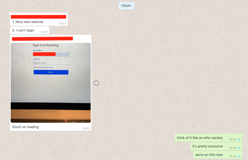
I got stuck trying to use it
One of the things we've learned about working with developers is that a lot of technical people will try your thing out, if they can.
Make sure someone else is using your product in production before you launch it. You'll get no end of edge cases. Or even "majority cases" cases like the first ever user of PostHog:

Hey, at least they liked the website.
We had a handful of friends using PostHog first, then we ran some Twitter ads to get a further 20 ish companies using the product, then we put it on Hacker News.
Do not let this slow you down though (just optimize for "does anyone care" early on) - it took us just a month of intense work to do this, as one example. See some other things that are fast.
Example | Example 2 | Example 3 | Example 4
This doesn't seem like a sustainable business
If your thing looks unsustainable, then no one wants to rely on it.
The basics here are:
i) there's some way of making money from the thing that is obvious to readers ii) if the target marget is super niche, then it has an obvious (or explained) path to expanding beyond this
Example | Example 2 | Example 3
I need to know how much it'll cost
Put pricing on there if you can.
If you're not ready to create a paid version yet, then state your plans in this area (and create an easy way for people to get in touch so you can get all the signal you can).
If you do have pricing, be as clear as possible on how your plans work.
Fun fact: PostHog's pricing page is the second most popular place for homepage visitors to go, second only to logging in.
Example | Example 2 | Example 3 | Example 4 | Example 5 | Example 6
I can't see the difference between this and X?
If you're building something in a crowded space, like - say - product analytics, people need a very good reason to use a tiny new startup's thing, over a better established competitor,
Reasons they feel this way:
- your thing won't have many features
- it will be buggy
- people may not trust you with their data
These can all be offset by early adopters if there is something important that is different about what you're working on.
Extreme example | Example 2 | Example 3 | Example 4
I don't trust you with my data, or I have a security concern
Small signals that you know what you are doing are the creator of a technical product are important. A privacy policy, for example, or no obvious security flaws. No typos, nice design - the details all add up here.
Transparency is a way to build on this. Explain exactly how you handle data, and what your business is aiming to be. If you've got VC funding, some users will assume you're somehow going to harvest and sell data if there's no clear business model.
In the rush to get a Minimum Viable Product out, it's easy to overlook the importance of security. A little effort here can go a long way.
Example | Example 2 | Example 3 | Example 4 | Example 5
This title is misleading
Misleading / clickbaity titles get called out.
Clearly, your title must be interesting ("would I read this"), but it has to be truthful.
Example | Example 2 | Example 3 | Example 4
I disagree with this approach
So, you've built something different. Just make sure you've got some early user feedback, and have thought it through.
If you have done those things, polarizing people is better than invoking no feelings at all. Your project will die if it's forgetful.
Example | Example 2 | Example 3 | Example 4
This won't load on mobile
Lots of people reading news websites are using mobile devices. We hit the front page on Hacker News recently and had 27k visitors on desktop, 21k on mobile (and 347 on tablets). Fact.
I could build this myself
It's an in-joke.

Subscribe to our newsletter
Product for Engineers
Read by 100,000+ founders and builders
We'll share your email with Substack
PostHog is an all-in-one developer platform for building successful products. We provide product analytics, web analytics, session replay, error tracking, feature flags, experiments, surveys, LLM analytics, logs, workflows, endpoints, data warehouse, CDP, and an AI product assistant to help debug your code, ship features faster, and keep all your usage and customer data in one stack.


