


MDX components
Contents
There are some nifty MDX components available for use in Markdown content. These components are included globally, so you don't need to do anything special to use them (like renaming .md to .mdx or manually importing them at the top of the file).
Images
Product screenshots
The <ProductScreenshot /> component encapsulates an image with a border and background. It's useful since the app's background matches the website background, and without using this component, it can be hard to differentiate between the screenshot and normal page content. It also optionally supports dark mode screenshots.
You use it by passing image URLs to the imageLight and imageDark props like this:
Optionally pass zoom={false} if you don't want the image to be zoomable, otherwise it will be zoomable by default.
Note: If you don't have a dark image, just leave out the imageDark prop and the light screenshot will be used for both color modes.
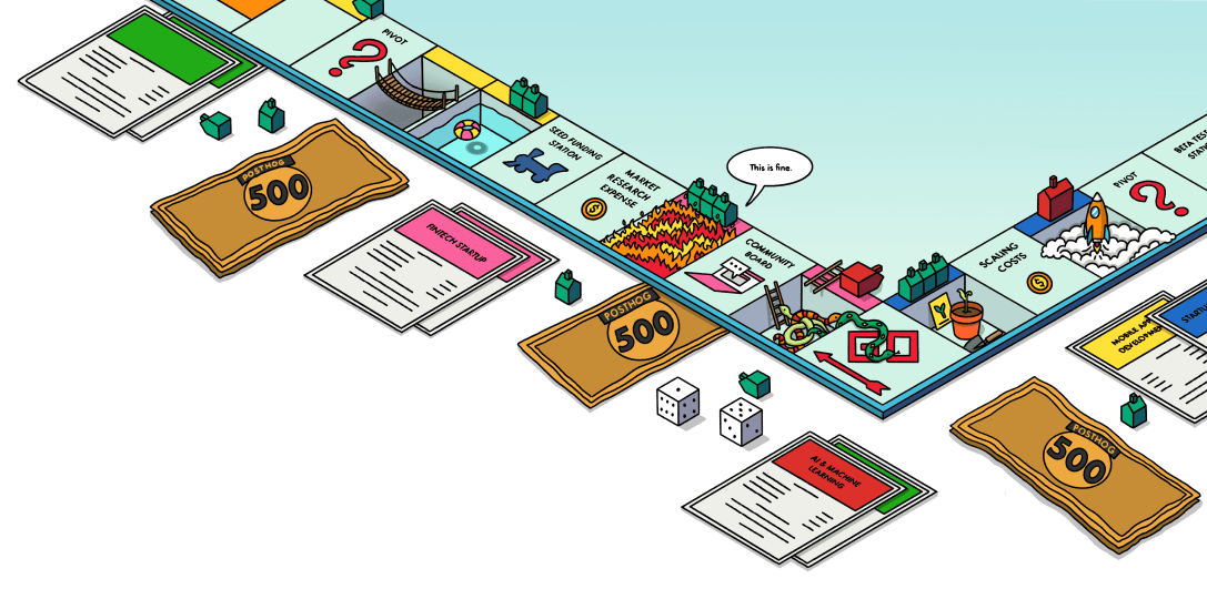
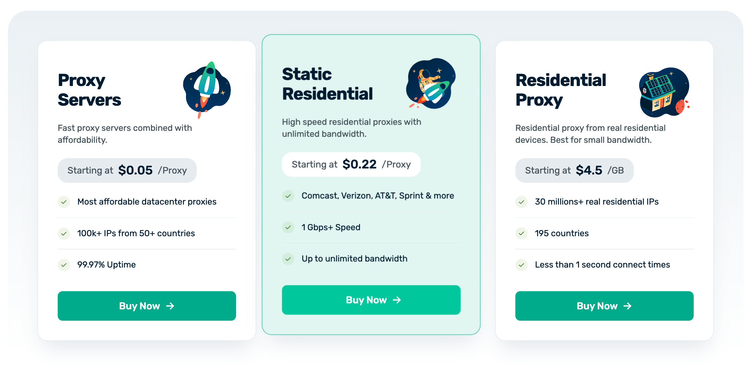
Image slider
You can create a slider or carousel of images by wrapping them in the <ImageSlider> component like this:
See an example in our open-source analytics tools post.
Videos
Th <ProductVideo /> component works the same as product screenshots (above) for videos uploaded to Cloudinary but supports light and dark videos.
- Import the video(s) at the top of the post (directly following the MDX file's frontmatter and dashes):
- Use the component wherever you want the video(s) to appear.
Note: If you don't have a dark video, just leave out the videoDark prop and the light video will be used for both color modes.
Embedding Wistia videos
This can be used in articles like tutorials or blog posts for longer-form videos (where the asset exceeds 20 MB and can't be uploaded to Cloudinary).
Embedding YouTube videos
While not an MDX component, a reminder that when embedding a YouTube video, you should do two things:
- Use the
-nocookievariant of the YouTube URL. eg:
- Add the
allowfullscreenattribute to the iframe so users have the option to watch the video in fullscreen (useful for reading code snippets).
Example:
Code blocks
The PostHog website has a custom code block component that comes with a number of useful features built-in:
Basic codeblock
Codeblocks in PostHog are created by enclosing your snippet using three backticks (```) or three tildes (~~~), as shown below:
This will produce the following codeblock:
Adding syntax highlighting
Syntax highlighting can be added by specifying a language for the codeblock, which is done by appending the name of the language directly after the opening backticks or tildes as shown below.
This will produce the following output:
Using tabs
You can use the <Tab /> component to create tabs in your code blocks. This is useful for showing multiple code snippets or examples in a single code block.
Supported languages
Here is a list of all the languages that are supported in codeblocks:
Frontend
| HTML | html |
| CSS / SCSS / LESS | css / less |
| JavaScript | js |
| JSX | jsx |
| TypeScript | ts |
| TSX | tsx |
| Swift | swift |
| Dart | dart |
| Objective-C | objectivec |
Backend
| Node.js | node |
| Elixir | elixir |
| Golang | go |
| Java | java |
| PHP | php |
| Ruby | ruby |
| Python | python |
| C / C++ | c / cpp |
Misc.
| Terminal | bash or shell |
| JSON | json |
| XML | xml |
| SQL | sql |
| GraphQL | graphql |
| Markdown | markdown |
| MDX | mdx |
| YAML | yaml |
| Git | git |
Note: If you want syntax highlighting for a snippet in another language, feel free to add your language to the imports in languages.tsx and open a PR.
Multi-language code blocks
You can use the <MultiLanguage> component to show code blocks in multiple languages.
Multiple code snippets in one block
With PostHog's MultiLanguage component, it's possible to group multiple code snippets together into a single block.
Note: Make sure to include empty lines between all your code snippets, as well as above and below the
MultiLanguagetag
This will render the following codeblock:
Specifying which file a snippet is from
You can specify a filename that a code snippet belongs to using the file parameter, which will be displayed in the top bar of the block.
Note: Make sure not to surround your filename in quotes. Each parameter-value pair is delimited by spaces.
This produces the following codeblock:
Code highlighting
Especially in long tutorials, you can highlight the important differences between steps using highlighting comments. It's much easier to read visual diffs than reading through the code block line by line.
| Comment | Effect | Usage |
|---|---|---|
// + | Green highlight | Represents additions in diffs |
// - | Red highlight | Represents removals in diffs |
// HIGHLIGHT | Yellow highlight | General emphasis without special meaning |
Collapsed code blocks
In some cases, such as large nested config files, you need readers to focus on a specific part of the code block while maintaining the context. You can do this by adding focusOnLines= to the code block. This collapses the code block and only shows the lines of code you specify.
Mermaid diagrams
Code blocks can also be used to show mermaid UML diagrams. When using these diagrams, make sure to include a text description of the diagram afterwards for accessibility and LLMs.
Product list
Use <ProductList /> to render a list of products sourced from useProduct hooks. It links each product to /{slug} by default using the product's icon, color, and name.
Auto-source from a product data field (e.g. every product where wizardSupport is set):
- Product Analytics
- Session Replay
- Error Tracking
- Web Analytics
- Feature Flags
- Experiments
- AI Observability
- Logs
Products are grouped in sourceValues order. Plain values (true, "some string") filter without an indicator. Object values ({ value, color }) also render a colored dot with tooltip text.
Manual list of products:
Manual list with field-based filtering and indicators:
Only the products whose wizardSupport value matches a sourceValues entry will render. Other props: urlPrefix (default /), className, itemClassName, iconSize.
Wizard command
Use <WizardCommand /> to render a copyable install button for the PostHog wizard CLI. Clicking the button copies the command to the clipboard and shows a toast notification.
The command automatically includes --region eu or --region us based on the user's feature flags.
Props:
| Prop | Type | Default | Description |
|---|---|---|---|
latest | boolean | true | Appends @latest to the package name |
slim | boolean | false | Hides the "Learn more" link below the button |
className | string | '' | Additional classes for the button element |
Slim mode (button only, no "Learn more" link):
Without @latest (used on the homepage and wizard page):
Call to action
Adding <ArrayCTA /> to any article will add this simple CTA:
Don't overuse it, but it's useful for high intent pages, like comparisons.
Feature comparison tables
When comparing features between two or more products, use the <ProductComparisonTable /> component which sources data from the src/hooks/competitorData/ directory and lets you compare specific features across multiple competitors.
Read more in the product & feature comparisons handbook page.
Captions
You can add captions below images using the following code:
Here's an example of what it looks like:
Customer quotes
Add a styled quote component using the following code:

PostHog is super cool because it is such a broad platform. If you're building a new product or at a startup, it's a no-brainer to use PostHog. It's the only all-in-one platform like it for developers.
Product-specific quote

PostHog gives me all the same information Plausible used to give us, and a lot more. It's way more powerful and insightful than Plausible.
Generic quote
We mainly use them in customer stories and some product pages.
Quotes are sourced from the useCustomers hook and can reference product-specific quotes or general quotes by someone at a company. Be sure to add the customer's information to the useCustomers hook in src/hooks/useCustomers.tsx.
Example
Collapsible sections
The combination of <details> and <summary> components enables you to add a collapsible section to your page. Useful for FAQs or details not relevant to the main content.
Tabs
Tabs enable you to display different content in a single section. We often use them to show different code examples for different languages, like in installation pages.
To use them:
- Import the
Tabcomponent. - Set up
Tab.Group,Tab.List, andTab.Panelfor each tab you want to display. Thetabsprop inTab.Groupshould be an array of strings, one for each tab. This enables you to link to each tab by its name. - Add the content for each tab in the
Tab.Panelcomponents. You should use snippets for readability, maintainability, and to avoid duplication, but you can use multiple snippets in a single tab.
For example, here's how we can set up tabs using error tracking snippets:
You can default to a specific tab by passing the tab name in the query string like:
Links
Linking internally
Use Markdown's standard syntax for linking internally.
Be sure to use relative links (exclude https://posthog.com) with absolute paths (reference the root of the domain with a preceding /).
| Correct syntax | /absolute-path/to/url |
| Incorrect syntax | https://posthog.com/absolute-path/to/url |
Open a new PostHog window
To open a link in a new window within the PostHog.com OS interface, use state={{ newWindow: true }} like:
Linking externally
The <Link /> component is used throughout the site, and is accessible within Markdown. (When used internally, it takes advantage of Gatsby's <Link /> features like prefetching and client-side navigation between routes).
While that doesn't apply here, using it comes with some handy parameters that you can see in action via the link above:
- Add
externalto a) open the link in a new tab, and b) add the external link icon (for UX best practices if forcing a link to open in a new window) - If, for some reason, you need to hide the icon, use
externalNoIconinstead
Example:
Private links
Sometimes we link to confidential information in our handbook. Since the handbook is public, it's useful to indicate when a link is private so visitors aren't confused as to why they can't access a URL (like a Slack link or private GitHub repo). Use the <PrivateLink /> component for this. See an example (on our share options page.)
Private links will always open in a new browser tab.
Mention a team member
Use this component to mention a team member in a post. It will link to their community profile and appears like this: Cory Watilo
There's also a photo parameter which will inline their photo next to their name like this:  Cory WatiloCory Watilo
Mention a small team
Use this component to mention a small team in a post. It will link to their team page and appears like this:


The default version shows the team's mini crest and name in a bordered "chip" style. There's also a noMiniCrest parameter to omit the mini crest and border for inline usage like this: Website Team
Both versions will show the full team crest on hover. Clicking the tooltip will open the team page in a new window.
Embedded posts
You can embed what looks like a Tweet an X post using the <Tweet> component. It's used on the terms and privacy policy pages, but was componentized for use in blog posts to break up bullet points at the top of the post.
Note: This does not actually embed an X post ; it's just styled to look like one.

Usage
Be sure to change the alert message which appears if you click one of the action buttons (reply, repost, like).
You can optionally center the post with the mx-auto class (shown in the example code, but not used in the preview above).