


An engineer's guide to vibe design (with prompts)

Contents
Design used to be a dependency. If the Figma wasn't ready, neither were you.
Enter vibe designing.
With tools like Lovable, v0.dev, and Bolt, you can ship polished apps without waiting on anyone else.
This post shows the full process – start to finish – by actually designing a tiny app while we go. No designer in the loop, just vibes, taste, and a few rounds with an LLM.
Step 1: Define your job to done
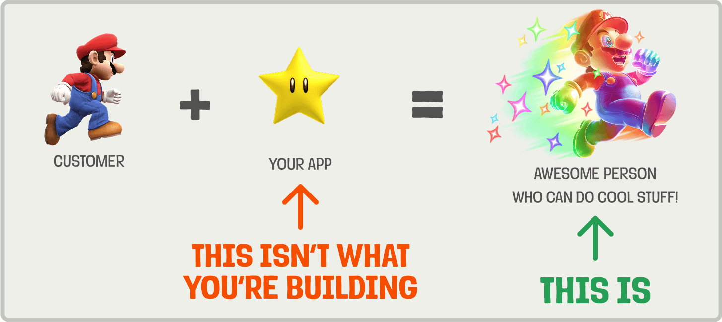
People don't care about your product. They care about getting their job done.
Your first step is to define that job in a single sentence. This isn't just a nice-to-have, it's your design compass. It makes priorities obvious and tradeoffs easier to navigate.
A good statement is anchored in real user context and focuses on their desired outcome. A practical way to define it is:
When [trigger] happens, [user persona] wants to [action], so that they can [desired outcome].
Here are some examples:
Example 1: Incident management tool (e.g. incident.io)
- ❌ "Engineers need to send incident updates."
- ✅ "When an incident occurs, engineers want to communicate status updates quickly and clearly, so that customers and internal stakeholders stay informed and trust is maintained."
Example 2: Team wiki product (e.g. Notion)
- ❌ "Employees want a company handbook."
- ✅ "When an employee has a question, they want to find the relevant answer quickly, so that they can stay productive without asking someone."
Example 3: Issue tracker (e.g. Linear)
- ❌ "Developers want to track bugs."
- ✅ "When a developer hits an error, they want to log a bug quickly and hand it off, so that they can get back into their flow."
For the rest of this post, we'll use the issue tracker example and create a tiny bug tracker called BugSplat 🐞💥

Subscribe to our newsletter
build mode
Read by 75,000+ founders and builders
We'll share your email with Substack
Step 2: Steal like a product engineer
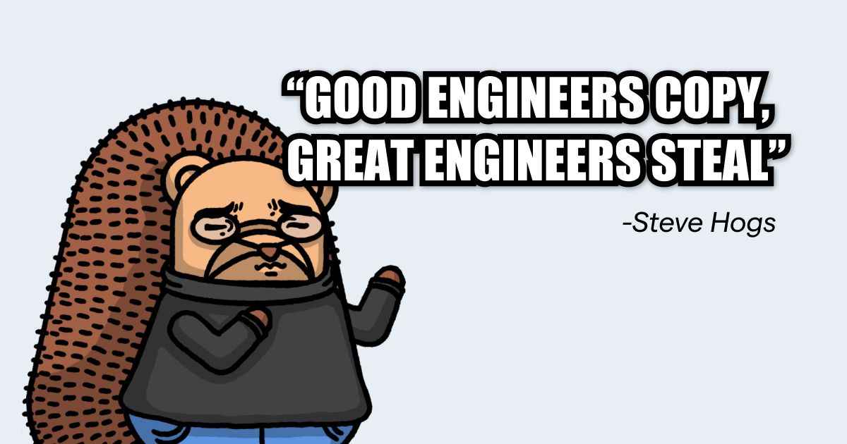
With your job to be done in mind, steal inspiration from existing products by playing with them. Pay attention to how they look and feel. A few things to think about:
- First impressions: Where do your eyes go first?
- Flow: How many steps or clicks to achieve the job?
- Feel: Calm? Overwhelming? Playful?
- Micro‑interactions: Subtle animations, hover/focus states, error/success cues.
- Performance: Perceived speed, load times, skeletons while fetching.
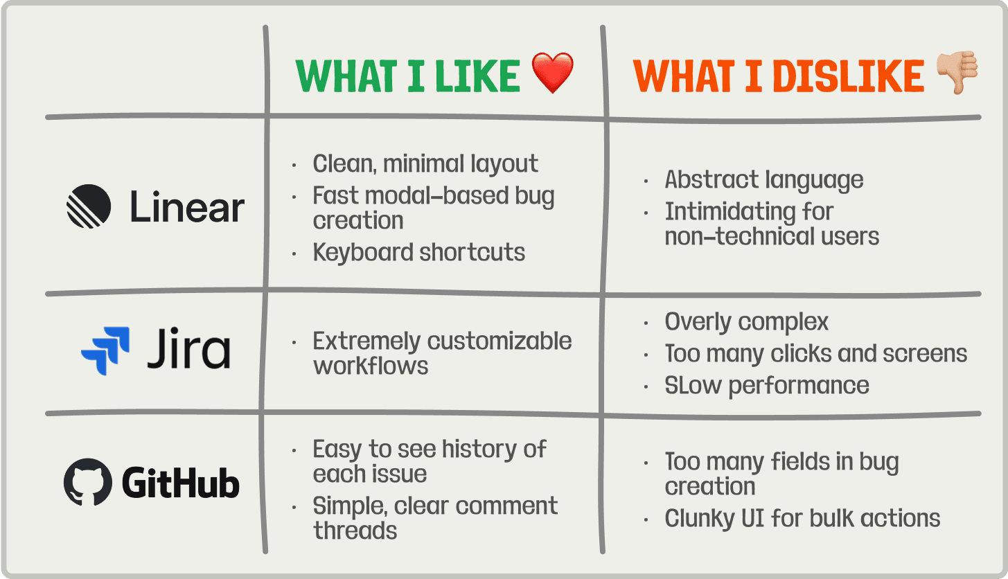
Take screenshots and scribble notes. You now have a taste bar for yourself and references you can share with an AI.
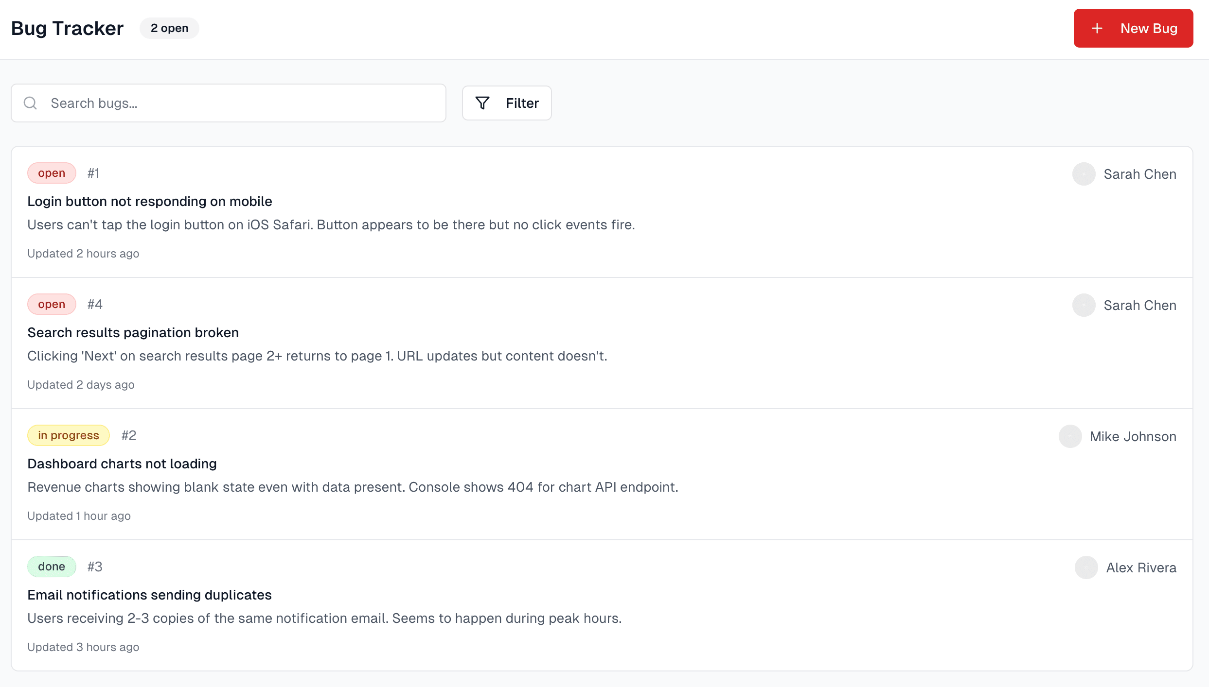
In the case of BugSplat, here's what I found when I researched similar apps:
Step 3. Wireframe with an LLM
You should now have a strong opinion of how you want your app to look and feel. The next step is to wireframe it and see how the UX holds together.
Lovable, v0.dev, or Bolt can get you to a working wireframe fast. The key is to give them enough context on what the app should do, who it’s for, and how it should feel. Don’t forget to include your notes and screenshots from your competitor research.
Here's the template I use:
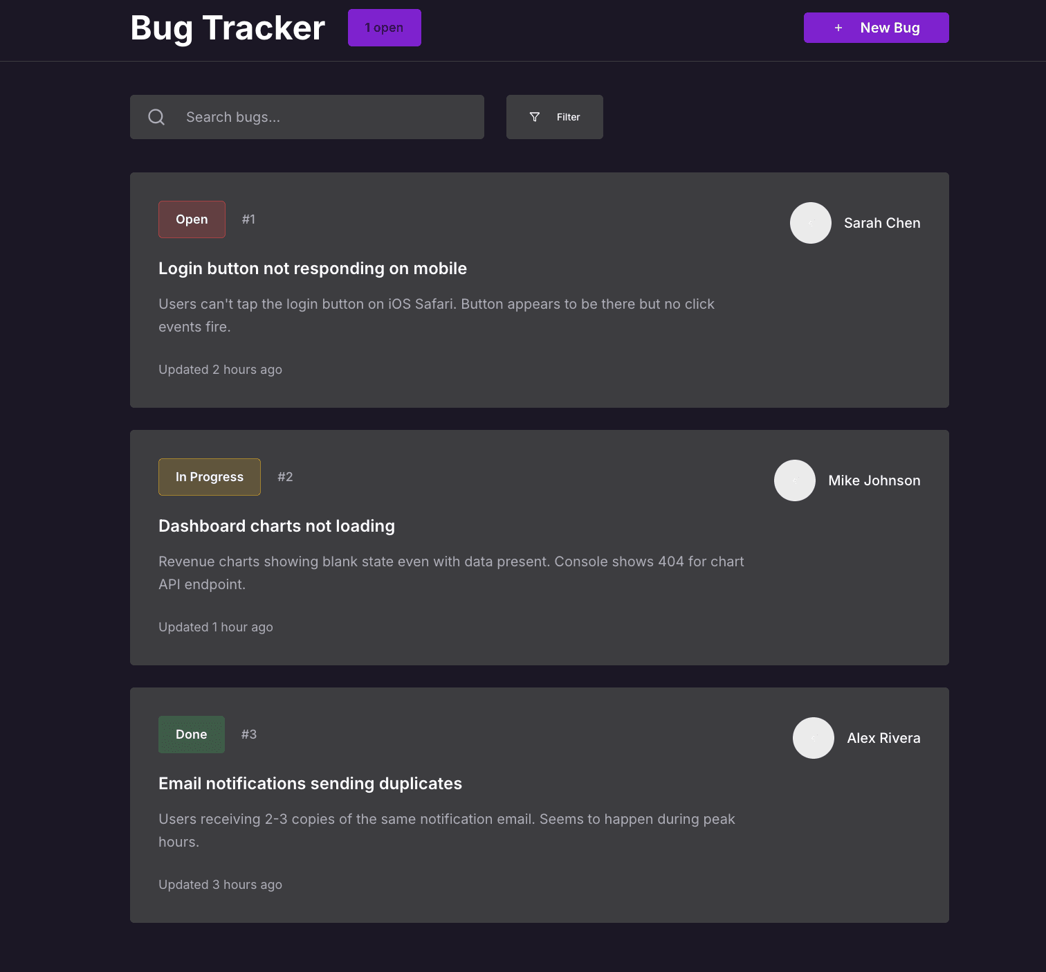
Keep prompting until the wireframe feels right. Here's the full prompt I used for BugSplat:
And the wireframe is generated:
Step 4. Bring it to life
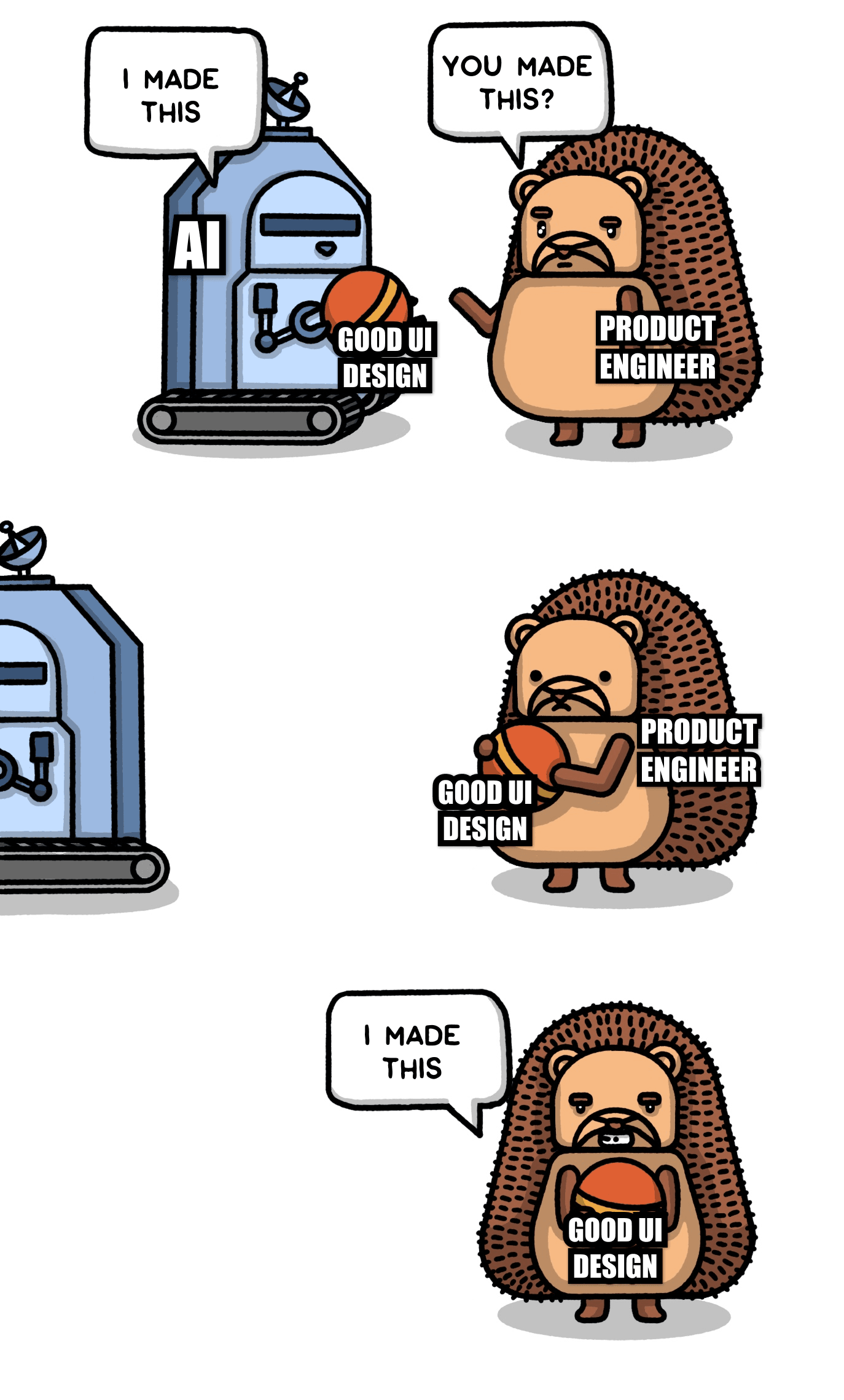
Once you're happy with the wireframes, the next step is to make it look and feel like a real product. How you approach this depends on whether you're adding a feature to an existing app, or building something completely new.
a. Slotting into an existing app:
Prompt the LLM that has your wireframe to flesh out the UI with your app's design system. The more context you provide, the closer the output will match your actual product. Useful inputs include:
- UI components for core interaction patterns
e.g.components/ui/button,input,card - Layout primitives to show how you handle spacing and structure
e.g.layout/container,grid - Design tokens for colors, typography, and spacing
e.g.tailwind.config.js,theme.js - Page layouts to demonstrate full-page structure and composition
e.g.layouts/app-layout,dashboard-layout - Real screens to show how everything comes together in context
e.g.pages/settings,user-profile
Here's a prompt you can use:
b. Building a brand new app
With no legacy design language, you need to create enough scaffolding to keep the LLM from wandering into neon gradients and Comic Sans.
To start, generate your app's core color palette. I like using Coolors or Figma's palette generator for this. If you're stuck on deciding on a color palette, draw inspiration from your favorite apps.
💡 Tip: If you're stuck on deciding on a color palette, draw inspiration from your favorite apps.
Once you have 4-6 foundational colors, use an LLM to map them to key roles in your UI (e.g., buttons, text, backgrounds, and so on). Here's a prompt to do that for you:
Next, take your generated color JSON and feed it back to Lovable/v0/Bolt along with the prompt below. You’re giving it the building blocks (colors, typography, spacing, shadow, etc.) to generate a cohesive design system. You'll probably need to prompt it further to tweak the output to your liking.
I opted to create a modern and minimalist dark mode feel for BugSplat. Here's what it looked like after creating and applying my design system:
Step 5. Final polish 💅🏼
You should now be 90% of the way there. The final 10% is polish.
Great design isn't magic. It's a set of rules you can learn. And applying them correctly means you don't need to guess what looks good.
Here are six foundational principles every engineer should know. Your UI should pass each one.
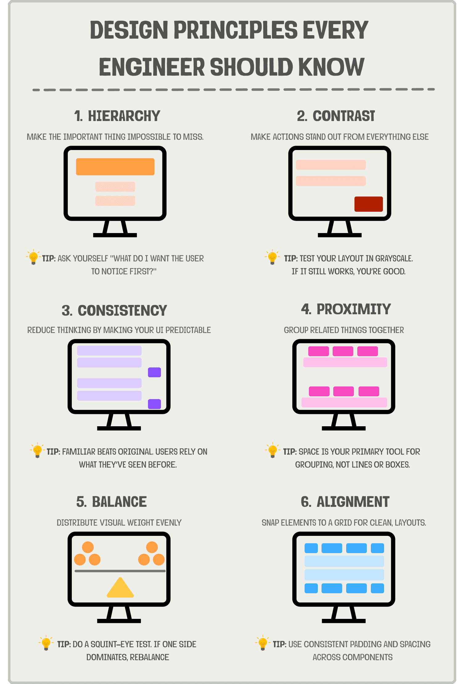
Applying the rules to BugSplat, I noticed a few things:
Hierarchy:
- ❌ The "Bug Tracker" headline is large, but not actually important. Should be smaller.
- ❌ The ticket's last updated time is more important than the description, so it should appear above it.
- ❌ The filter button text is too small.
Contrast:
- ❌ The filter button background is the same as the tickets, making it hard to notice.
- ❌ The purple text which shows the total number of open tickets is hard to read.
Balance:
- ❌ The tickets currently skew components heavily to the left.
Consistency
- ❌ The number of open tickets component looks like a button but isn't.
- ❌ The new bug and filter buttons have different heights.
Alignment
- ❌ The white circles on the tickets representing the user’s profile pictures are not left-aligned, making it look awkward.
Proximity:
- ✅ Everything looks good
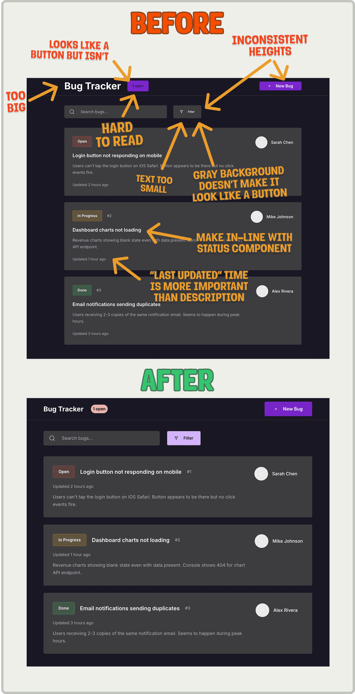
Ah, much better. Which brings us to the final step.
Step 6: Ship it and iterate
Once your UI is in decent shape, get it in front of real users as soon as possible. You'll learn more from watching someone use it than from any internal review.
Here's how to ship safely and learn fast:
- Use a feature flag to launch to a small group of trusted users first. It lowers the stakes and buys you space to improve.
- Watch session replays to spot where people hesitate, rage click, or bounce.
- Track key funnels so you know if users are actually completing the job to be done and not just poking around.
- Talk to real humans. Ask what felt slow, confusing, or unnecessary. You'll be surprised what they struggle with.
- Iterate quickly. One small fix at a time adds up fast.
TL;DR
You can be a designer too. The process is learnable and can get you shipping in hours instead of weeks.
Subscribe to our newsletter
build mode
Read by 75,000+ founders and builders
We'll share your email with Substack
PostHog is the leading platform for building self-driving products. With a full suite of developer tools – AI observability, product analytics, session replay, feature flags, experiments, error tracking, logs, and more – PostHog captures all the context agents need to diagnose problems, uncover opportunities, and ship fixes. A data warehouse and CDP tie it all together, unifying that context into one source agents can read across. You can steer it all from Slack, the web app, the desktop (PostHog Code), or your own editor via the MCP.