

Visual identity
Contents
Overview
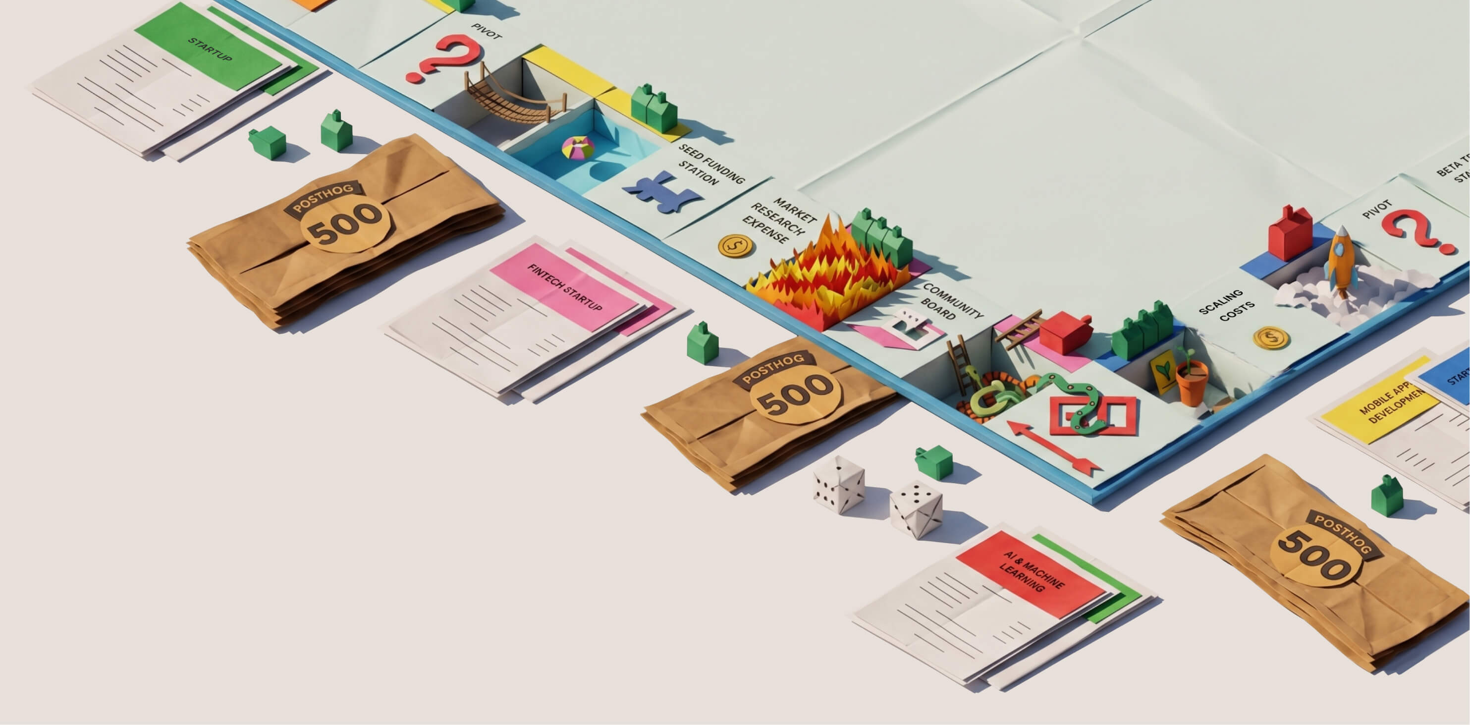
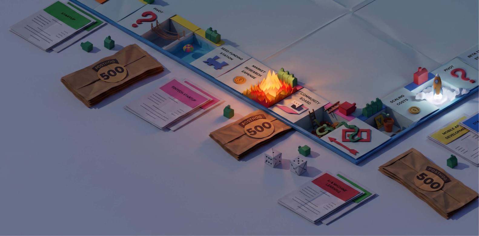
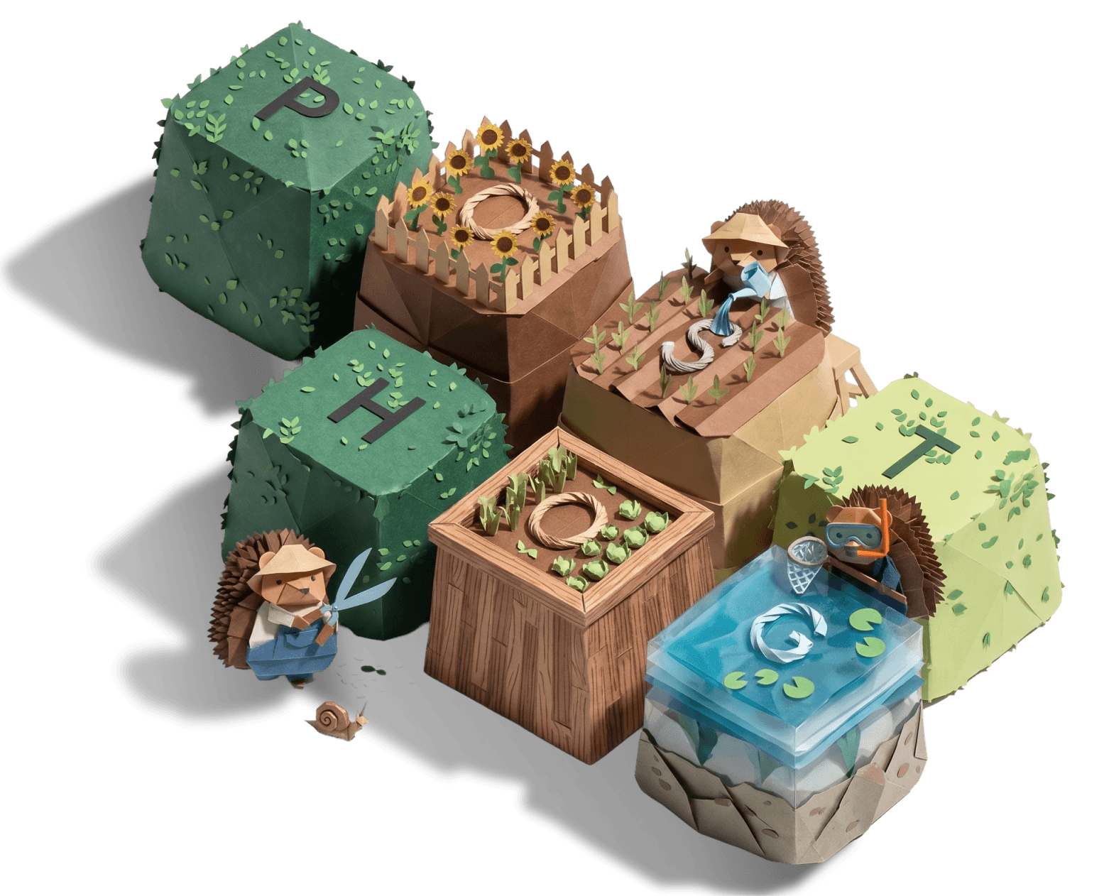
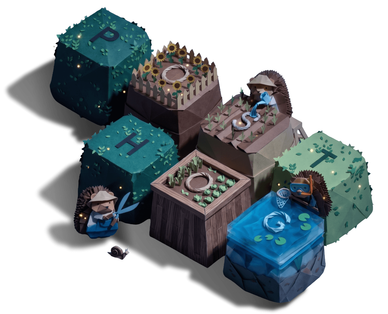
PostHog's visual identity is intentionally distinctive. It should feel handcrafted, slightly weird, thoughtful, and recognizable. If a design element could belong to any SaaS company, it probably isn't PostHog enough.
The test: remove the logo. Does it still feel like PostHog? It should.
This identity is also un-copyable – because it's a reflection of the people who made it, and it keeps evolving as they do. No design system doc can quite define it, because it's constantly evolving and is subject to the taste of the people creating it.
There's a version of PostHog that could use AI to produce all of its illustrations, icons, and copy. It would be faster and cheaper. It would also be instantly identifiable as not made by humans, and that trust signal would erode. Handcrafted beats generated.
Logo
Find logos on our brand assets page.
Variants
| Variant | When to use |
|---|---|
| Standard logo (horizontal, colored with gradient) | Default for the web. Use this most of the time. NEVER use on dark backgrounds. |
| Dark logo (black wordmark) | Light backgrounds where full-color feels off. |
| Light logo (white wordmark) | Dark backgrounds. |
| Logomark only | Small contexts (favicons, app icons, social avatars). Use only when the full logo won't fit. |
| Stacked logo | When horizontal space is limited but the full name is important. |
| 4-color logo | Print version, when gradients can't be printed. Only use the 4-color logo for this case. |
Download all variants from brand assets. SVG is always preferred.
Rules
- Never modify the logomark colors. Don't turn the hedgehog face white on a dark background. Use the white-logo variant instead.
- Never stretch, skew, rotate, or add effects to the logo.
- Never use the old logos. We updated it in 2021 (rounded the edges, rounded font) and then again in 2026 (gradient, no space between the body elements of the hedgehog). If you see the old versions anywhere, replace it or let us know in #design.
- Maintain clear space. Leave at least the height of the "P" in PostHog as clear space around all sides of the logo.
- Minimum size. Don't use the full logo below 80px wide. Use the logomark instead.
- On colored backgrounds. Use the light (white) version on dark/colored backgrounds. Never use the standard logo on a background that makes it unreadable.
What not to do
- Don't place the logo on a busy photographic background without a clear container or sufficient contrast.
- Don't use the logo as a watermark at reduced opacity.
- Don't surround the logo with other logos of similar size – it should have room to breathe.
- Don't animate the logo (spin, bounce, glitch) without explicit approval.
Color system
PostHog uses a deliberately limited palette. Fewer colors, used consistently, create a stronger visual identity than a sprawling palette used inconsistently. For hex values, see brand assets.
How to use color
Color guides attention – it doesn't decorate. In practice:
- Backgrounds should be solid, not gradient-heavy.
- Illustration is where color lives. Illustrations should be more saturated than the surrounding layout to draw the eye.
- The more color you use, the less any single color means. Use restraint.
- Use opacity to modify colors rather than adding new ones: paragraph text at 90%, links at 95%, links on hover at 100%.
Gradients. PostHog uses no gradient backgrounds by default. Gradients are a cliché of generic SaaS design. When in doubt, solid.
What to avoid:
- Rainbow palettes or too many simultaneous accent colors
- Dark-on-dark combinations with insufficient contrast
- Using red (#F54E00) for warnings or errors (it's a brand color, not a status indicator – use separate status colors in product UI)
Typography
PostHog uses three typefaces, each with a specific role. Using them correctly is one of the fastest ways to make something feel on-brand.
RoundHog
Our primary typeface. Used for all text on posthog.com and in most contexts.
Cuts used:
- Bold – Titles and section headers
- Semibold – Paragraphs with large headers, paragraph links
- Regular & Regular Italic – Body text
Italic variants are available for Regular, Medium, Semibold, and Bold.
Squeak
Used for marketing headlines and informal settings, generally accompanied by hedgehog artwork. This is our expressive, personality-forward display font, not used for copy or descriptions.
Usage rules:
- Always uppercase. No exceptions.
- Use the bold variant. No exceptions.
- Never use Squeak without hedgehog art or a deliberate informal context (event signage, stickers, merchandise, splash screens)
- Never use Squeak for body text, subtitles, or descriptions.
Loud Noises
Used exclusively for quotes in hedgehog artwork – the signs, speech bubbles, and text the hedgehogs are holding or saying.
Usage rules:
- Uppercase only
- Only in hedgehog artwork contexts
- Do not use for any other purpose
General typography rules
- Hierarchy is everything. A page with three levels of size that mean nothing teaches readers nothing. Every size choice should communicate something about importance.
- Sentence case for headings. "Documentation style guide" not "Documentation Style Guide."
- No decorative fonts beyond the three listed here.
- Left-align body text by default. Center-align is fine for short marketing headlines and call-outs.
- Line height. The most obvious way for a design to feel not quite right is for the line height to not be dialed in. Take special note of the line height for individual elements where text wraps, as well as the space between associated elements like a title and description. If you have questions, ask in #design-review.
Illustration & hedgehogs
Our mascot: Max
Max is our hedgehog mascot. He's a core part of the PostHog visual identity. He's a creative vehicle for translating our personality into something expressive and alive. Use him thoughtfully, not just to fill space. For how to draw him, see the illustration guide in brand assets.
Do not:
- Use AI-generated hedgehog art. PostHog is very particular about how Max looks, and AI doesn't get it right. If you need a new hog, request one.
- Modify existing hedgehog illustrations without approval.
- Use competitor hedgehog styles or derivative designs.
- Use our artwork on a personal website or for anything that isn't PostHog-related. While our code is open source, our brand assets are property of PostHog. (The exception is for assets explicitly intended for community use like desktop or mobile background images.)
Artwork library: Team members can find all hedgehogs under the Account menu -> Art library.
Illustration style (general)
Beyond Max, PostHog illustration has a consistent aesthetic:
- Custom, not stock. Stock illustrations are instantly recognizable and forgettable. We draw our own.
- Simple and expressive. Complex doesn't mean good. Usually the simpler illustration works better.
- Bold and graphic. Thick outlines, strong shapes, limited color palette.
- Bringing external elements into our world. We sometimes re-draw external things (competitor logos/mascots, cultural references) in our style.
Avoid:
- Trendy SaaS illustration (floating shapes, abstract blobs, isometric 3D)
- Stock art services
- Overly complex or detailed illustrations
- AI-generated illustration
Team crests
Team crests are bold, punchy graphic badges used to represent PostHog's internal small teams. They're an extension of the brand's slightly irreverent, self-aware personality.
- Bold, punchy designs
- PostHog's color palette
- Can appear on stickers, slide decks, team merch
Stickers
Stickers are a significant part of PostHog's culture and brand ambassador strategy. People actually use them. Rules:
- Small team crests can work well as stickers
- Die-cut is preferred over square/rectangle stickers
- White border with hard drop shadow is the PostHog sticker aesthetic
Portraits
When we need portraits of real people, we use hand-drawn realism style rather than photography alone. This keeps a human, handcrafted feel that's consistent with the broader illustration identity. Every employee has received a hand-drawn illustration based on a photo of them since the inception of when Lottie was hired as Graphic Designer.
Icons
PostHog uses three icon styles for different purposes:
| Style | Use case |
|---|---|
| Outlined vector icons (Central Icon System) | Interface/product UI icons |
| icons8 sticker pack | Stickers and casual contexts |
| OS-style icons | Website desktop |
We care a little too much about icon glyphs. Icons should be intentional.
- When an icon is accompanies by a label, the icon should be complimentary.
- When an icon is used without text, they should be clear enough to stand on their own.
Use restraint when selecting an icon, and rather than sourcing your own, ask in #design.
Interaction
User interfaces should feel...
- snappy, thus we don't use animation when hovering onto a button. It's okay to use an animation when leaving a button.
- interactive, thus a slight zoom effect on hover and a "pressing down" feel when clicking a button is a subtle way to spark joy.
Animation
When animation is used, it should feel deliberately understated – not flashy or attention-grabbing. Animation is one of the most challenging things to get right. Without extreme attention to detail (like easing, for example), icons can feel cheap. It's better to avoid animation than implement something that feels even a little bit off.
PostHog animation characteristics:
- Puppet rigging for character animation (Max and other hedgehogs)
- Shadows animate with the character
- Animate in rather than looping constantly (team crests, blog art) and ease out to a still final frame
Use animation to add delight and bring characters to life – not to distract from content.
Photography
When photography is used:
- Prefer candid, authentic shots over staged, stock-style photography
- Real team members > stock people
- Real situations > constructed scenarios
- If using desktop/screen mockups, keep them honest (don't fake impressive-looking data)
Product screenshots
Show, don't tell. A screenshot of PostHog in use tells a developer more about the product than any amount of words.
Capture process
Use html2design to capture real webpages and import them directly into Figma. This makes sanitizing data much easier than working from flat image exports.
All screenshots are stored in a private Figma file (private because source data may contain PII).
Using synthetic data
Replace real customer data with synthetic data before publishing. This isn't just about privacy; it's an opportunity. The data in a screenshot gets more attention than most copy. Use it to tell a story, reinforce a use case, or leave an easter egg for the developer who looks closely. A screenshot of a session replay showing a user clicking "Upgrade" 47 times, or a funnel named "Cory's Haircut Funnel" – these land with people who actually read the interface.
Make it specific enough to feel real, interesting enough to make someone smile.
Where screenshots live in the codebase
Screenshots are referenced through product hooks so they can be pulled in consistently across the site without duplication. See session replay for an example of how they're structured.
Light and dark – always both
Every screenshot must be captured in light mode and dark mode – always at the same time, with the same data visible. The two versions are paired: the website swaps between them automatically based on the visitor's color mode preference. If you update data in one version, update the other to match. A user should be able to switch color modes and see the screenshot change color while the content stays identical.
Export everything at @2x so text is crisp.
Responsive variants
For high-traffic placements like blog posts getting heavy social promotion or articles with paid traffic – produce up to four versions of each asset where relevant:
- Landscape, light mode
- Landscape, dark mode
- Portrait, light mode
- Portrait, dark mode
The website serves the appropriate version based on screen size and color mode. Desktop visitors typically see landscape; mobile visitors see portrait. This matters because a landscape screenshot with small UI details is often unreadable at mobile sizes.
Data visualization
Charts and graphs show up throughout posthog.com – in blog posts, feature pages, and as product screenshots. They follow the same principles as everything else: clarity first, PostHog palette, no decoration that doesn't earn its place.
Design principles for charts
- Less is more. Remove chart junk – unnecessary gridlines, tick marks, legends that explain what the axis already says. Every element should help someone read the chart faster.
- Label directly where possible. A label on the line beats a legend the reader has to cross-reference.
- One chart, one point. If a chart needs a paragraph of explanation to make sense, simplify it. If it's showing two different things, split it.
Color in charts
Use the PostHog color palette. Don't introduce new colors just for a chart. If a chart needs more colors than the core palette provides, use opacity or pattern fills before reaching for new hues. Using HSL color space ((hue, saturation, lightness)) over hex makes it easy to adjust the lightness without inadvertently adjusting the tone.
The same light/dark rule applies: if a visualization appears on posthog.com, it needs to work in both modes. This generally means using CSS variables or producing paired versions the same way you would a screenshot.
Annotations and context
A chart without context can mislead. When publishing a chart – especially in a blog post – annotate significant moments: a feature launch, a spike, a known data anomaly. Readers should understand why something happened, not just that it happened.