


Visualizing data warehouse data with insights
Contents
After linking your source, you can use its data in a trend, funnel, lifecycle, or stickiness insight like you would event or person data.
You can also create graphs and visualizations directly with the SQL editor.
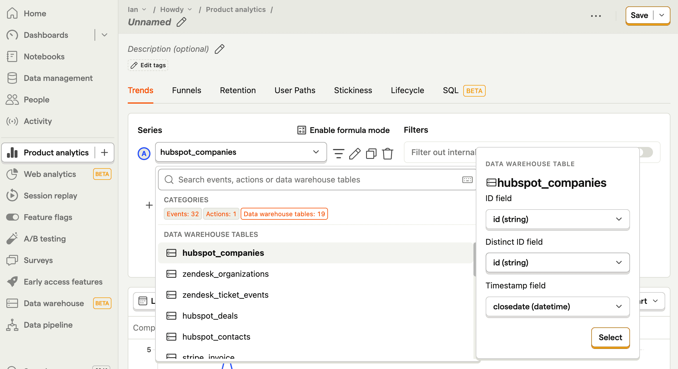
To do this, create a new insight, click the series, go to the Data warehouse tables tab, hover over the table you want, and click Select.
Insight specific fields
For each insight type you need to map a couple of fields in the data warehouse source. We can't reliably auto-map these fields for you, so we pre-fill with a best guess, but allow you to edit them.
Trend insights
| Field | Description |
|---|---|
| ID | A field that corresponds to the ID of the element. |
| Distinct ID | A field that corresponds to an ID representing the user associated with the element. If none, can match ID. |
| Timestamp | A timestamp or date field representing when the element was created. |
Funnel insights
| Field | Description |
|---|---|
| ID | A unique ID for each row in the table. Used to remove duplicates from the data source. |
| Aggregation target | The value used to match actors across funnel steps. When combining with event data, this should be a person or group identifier. |
| Timestamp | A timestamp or date field representing when the step happened. PostHog uses this to order steps and apply the funnel's date range and conversion window. |
If your funnel steps don't map cleanly to people or groups, set the insight aggregation to Custom aggregation target. In that case, Aggregation target can be any stable identifier or HogQL expression shared across steps. PostHog can still calculate funnel counts, but clicking through to actors only works when the aggregation target maps back to a person or group.
Lifecycle insights
| Field | Description |
|---|---|
| Aggregation target | The actor whose lifecycle you want to measure, such as a person ID, group key, or another stable identifier. |
| Created at | A timestamp or date field representing when that actor was first created, such as when a user signed up or an organization was created. |
| Timestamp | A timestamp or date field representing when lifecycle activity happened for that actor. PostHog uses this to decide which periods are new, returning, resurrecting, or dormant. |
For lifecycle insights, Created at and Timestamp are often different fields. For example, in a subscriptions table, created_at might be when the customer signed up, while invoice_paid_at might be the activity timestamp you want to analyze.
If the lifecycle should be calculated for something other than people or groups, set the insight aggregation to Custom aggregation target. In that case, Aggregation target should be a stable identifier or HogQL expression for that entity. PostHog can still calculate lifecycle counts, but clicking through to actors only works when the aggregation target maps back to a person or group.
Stickiness insights
| Field | Description |
|---|---|
| ID | A field that corresponds to the ID of the element. |
| Distinct ID | A field that corresponds to an ID representing the user associated with the element. If none, can match ID. |
| Timestamp | A timestamp or date field representing when the element was created. |
Clicking through to view individual actors is not supported for data warehouse tables in stickiness insights.
Using the same table multiple times
You can add the same data warehouse table multiple times in a single insight, each with different field configurations. This is useful when you want to track different stages of the same data.
For example, with a Salesforce opportunity table, you can create a funnel that tracks:
- Opportunity created - using
created_dateas the timestamp - Opportunity closed - using
close_dateas the timestamp
Each time you add the same table, you can configure different ID, Distinct ID, and Timestamp fields to represent different stages or events in your data.
Filters and breakdowns
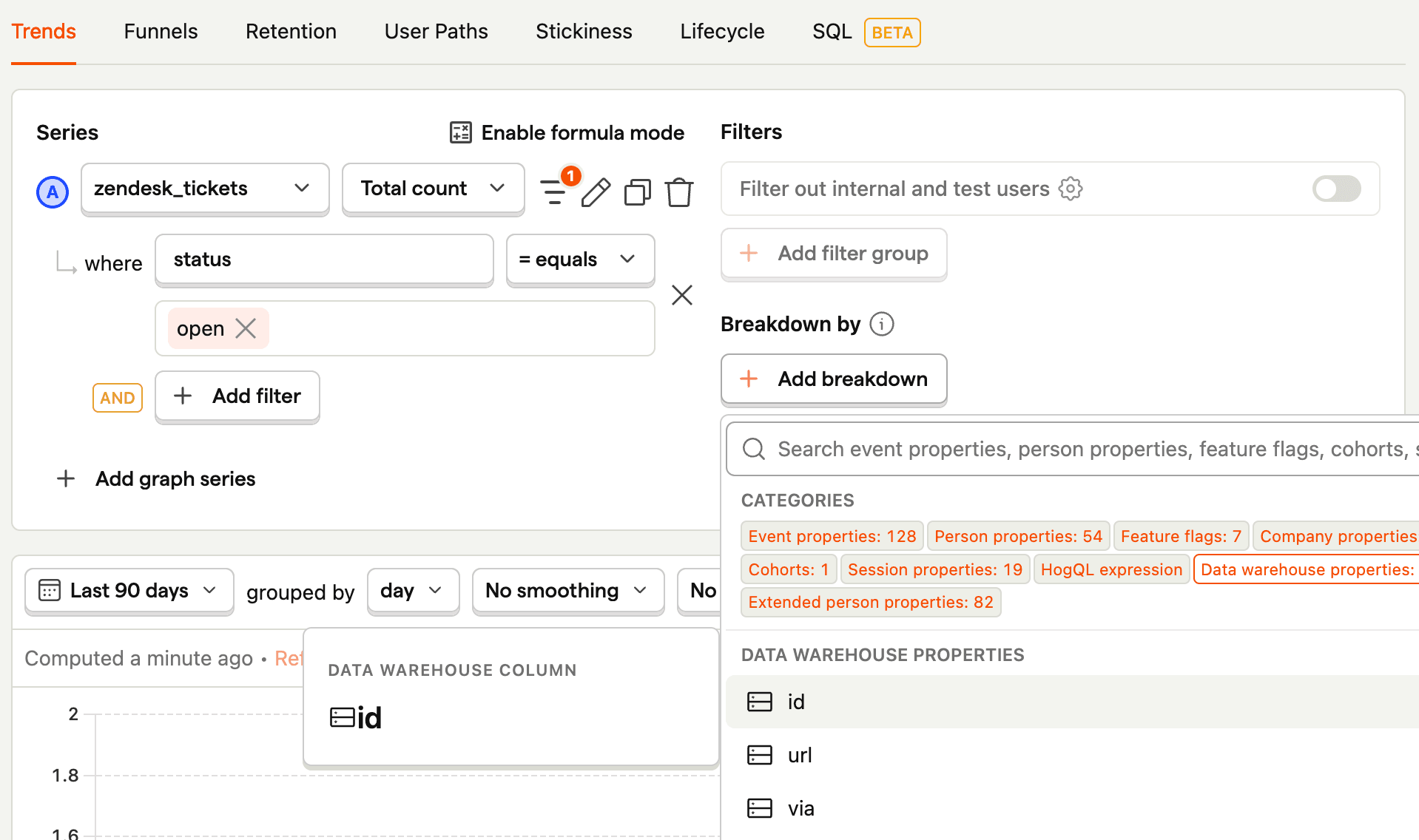
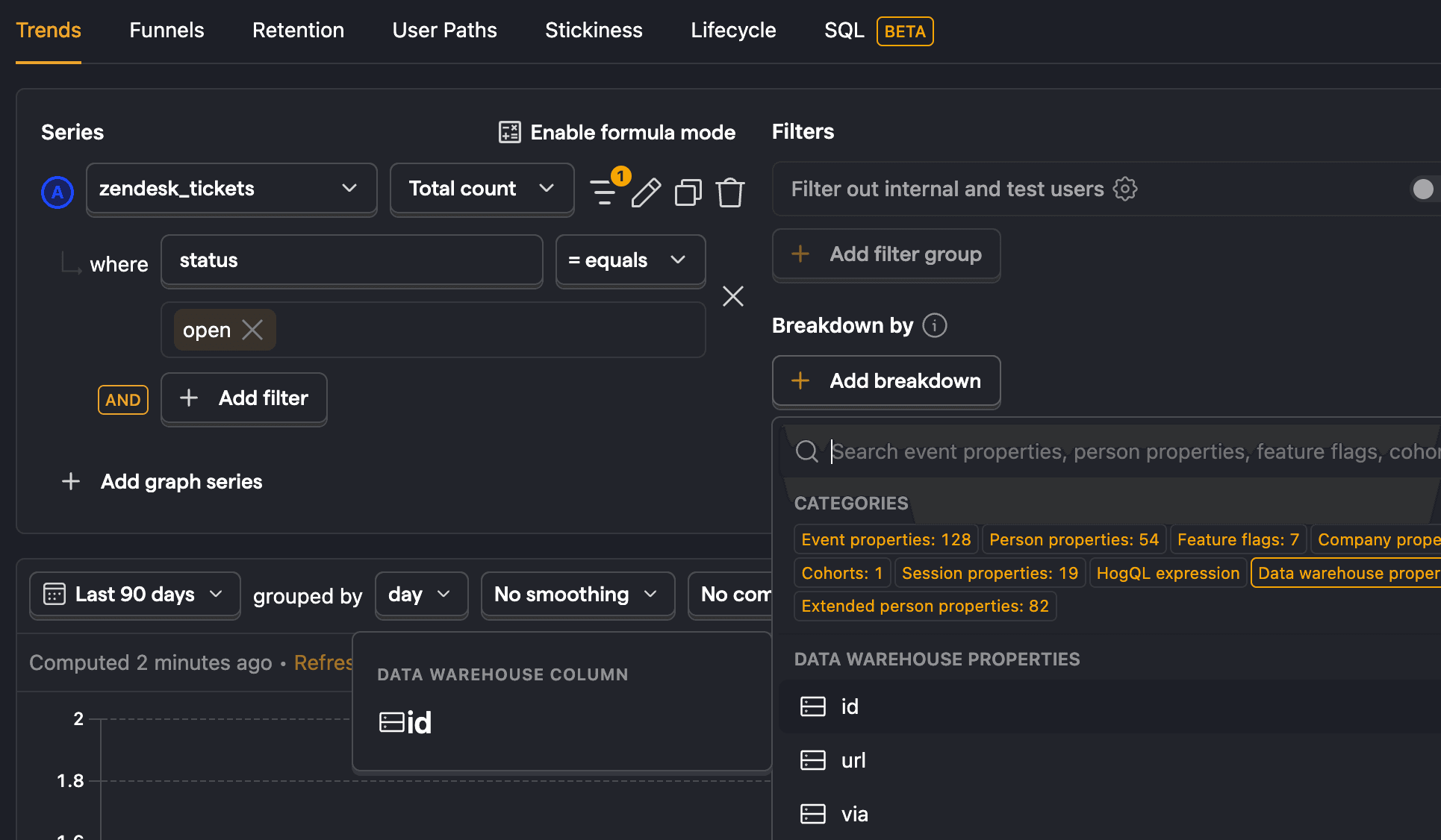
When using data warehouse tables in insights, you can use properties from those tables to filter and breakdown as you would with any other insight. For example, you could filter zendesk_tickets for ones where the status is open or hubspot_companies where lifecyclestage is lead.
Note: Dashboard property filter overrides are not applied to insights that contain data warehouse series. When such an insight appears on a dashboard with property filters, a warning is shown on the insight card. Date range overrides from the dashboard still apply.
Extended person properties
After setting up a join to the persons table, you can use the extended person properties of the joined table in filters, breakdowns, and more.
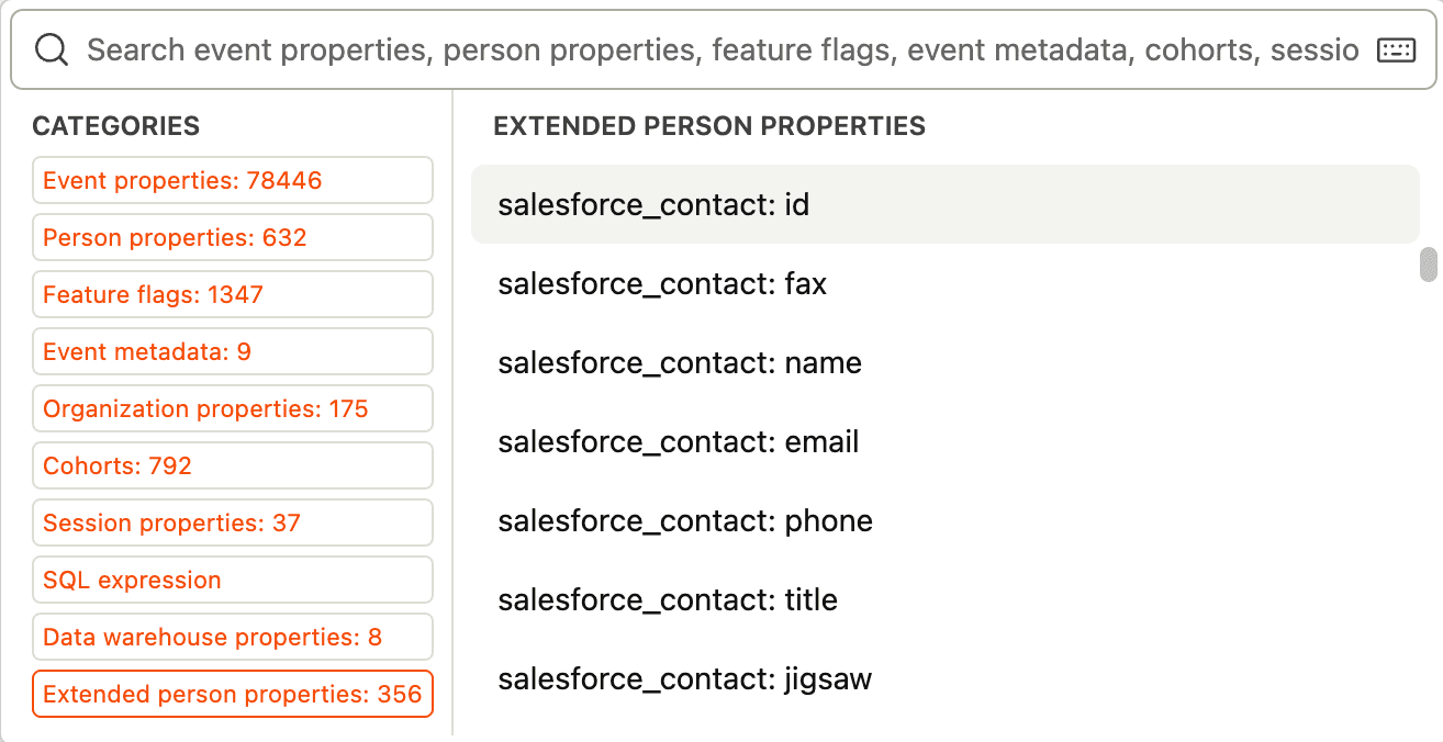
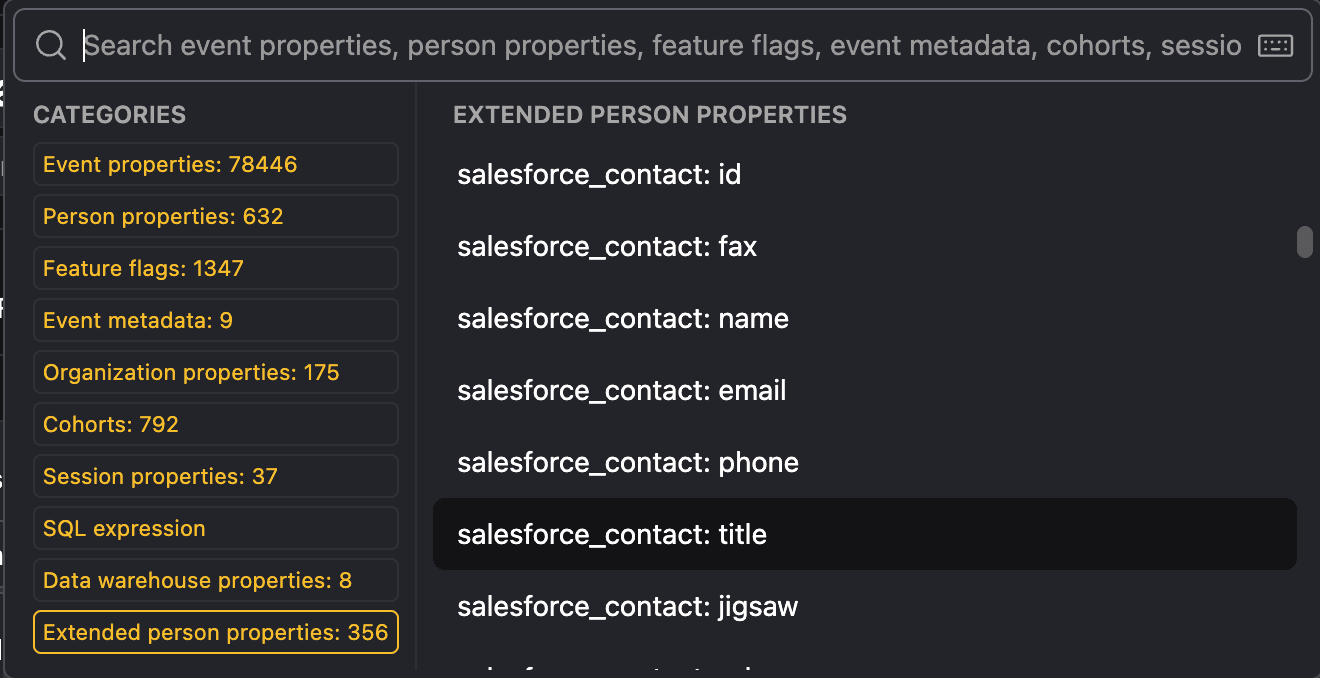
Learn more about how to set this up in our guide on joining data.