


Dashboard metrics
Contents
Customer Analytics is currently in beta and free to use. We're actively developing this feature and would love your feedback.
The customer analytics dashboard kickstarts your demographic customer analysis with the insights that matter. But what insights are these and why do they matter?
Active users (DAU/WAU/MAU)
The count of unique users who performed your activity event daily, weekly, or monthly.
This is your baseline pulse. If active users aren't growing or are declining, nothing else matters. But don't obsess over the absolute number early on, watch the trend. Consistent week-over-week growth (even small) suggests you're building something people want to return to. Flat or declining active users is a clear signal your product isn't sticky enough yet.
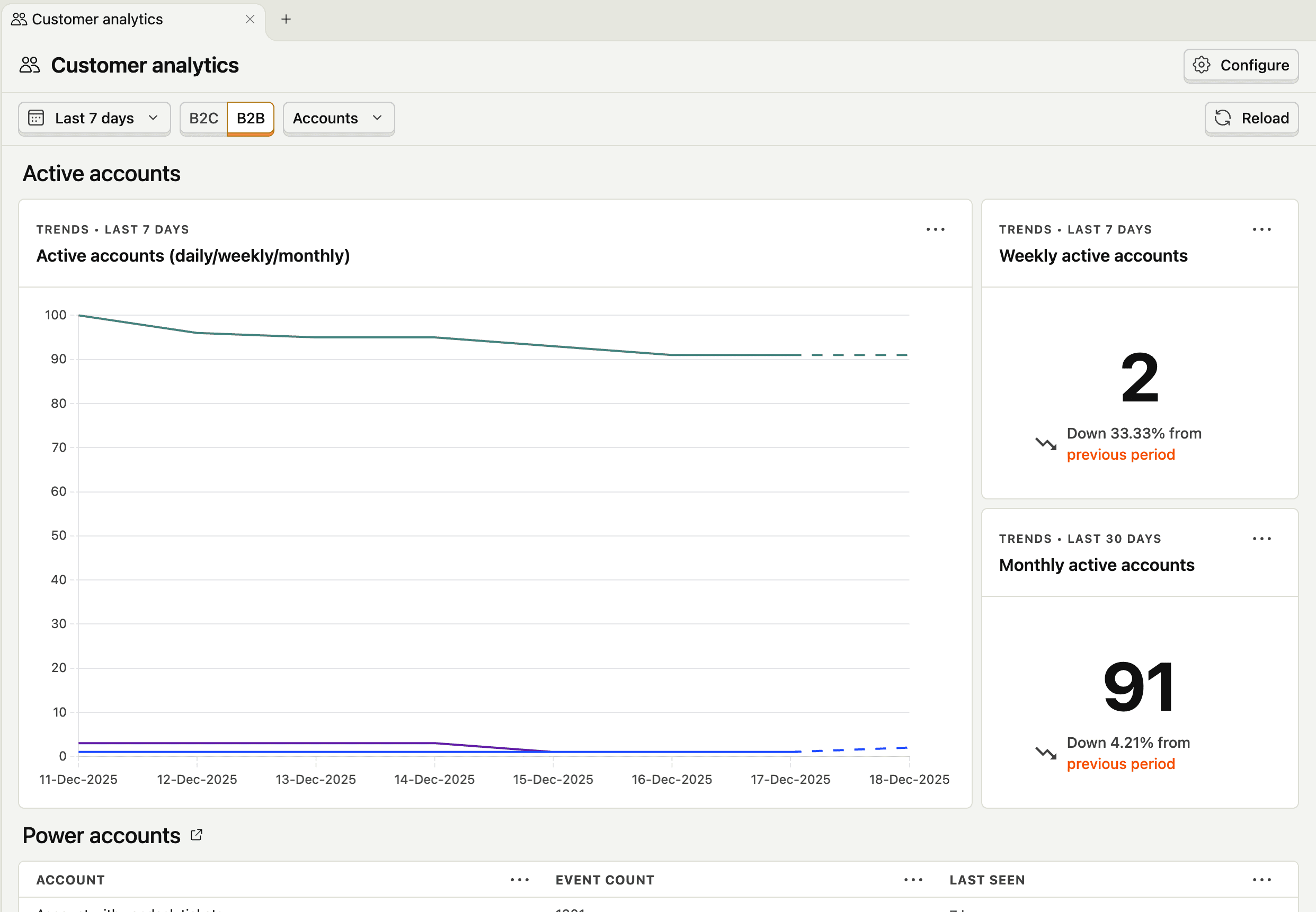
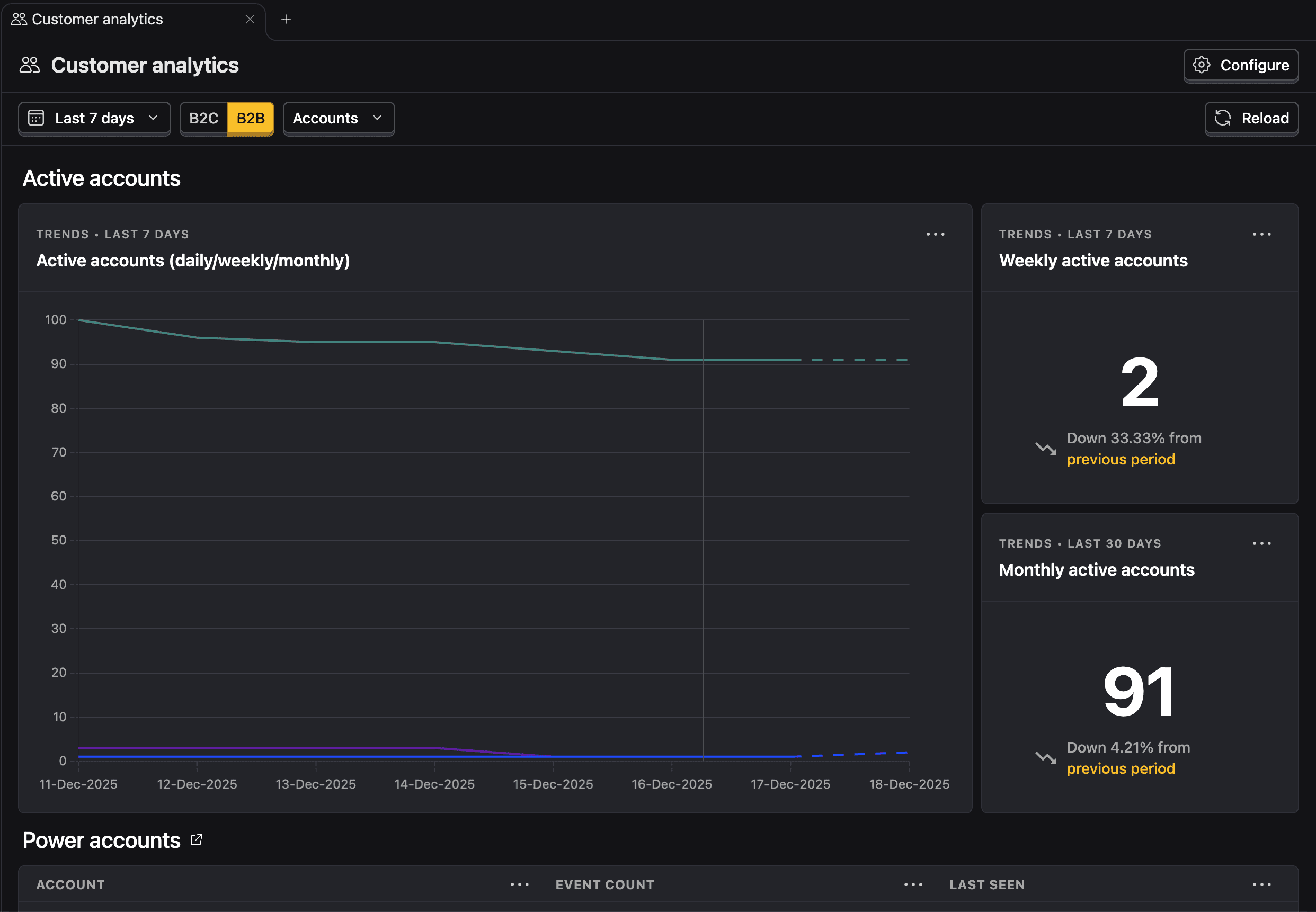
Power users
Users who engage with your product significantly more than average. Here we consider the users that performed your activity event the most in the last 30 days.
Power users are your canary in the coal mine. If you have a small but growing group of people who love your product and use it intensely, you likely have something worth scaling. These users will tell you what's working, become your word-of-mouth engine, and often pay first.
Early-stage, you want to identify who these people are and understand why they're power users. Use this insight to find what users you should talk to!


Signups and signup conversion
The number of new accounts created and the percentage of visitors who complete signup.
Signups measure whether your positioning and acquisition efforts are working: are you attracting the right people? Signup conversion specifically tells you if your signup flow is creating friction.
But here's the catch: signups alone are a vanity metric. A flood of signups with no activation or retention means you're attracting the wrong users or overpromising. Analyze this alongside customer engagement to see if the signups are translating into real usage.


Paying customers and free-to-paid user conversion
The count of users on a paid plan and the percentage of free users who convert to paid.
This is one of the strongest PMF signals. People paying you money is validation that your product solves a problem worth solving. Free-to-paid conversion rate tells you how effectively your product demonstrates value.


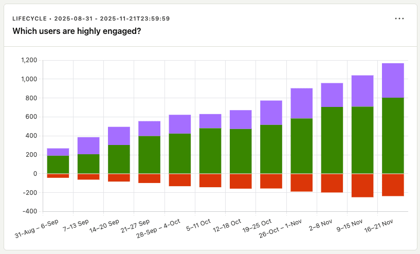
Engagement
A breakdown customers by their lifecycle stage in terms of the activity event.
Raw engagement counts hide what's actually happening in your user base. The lifecycle view exposes the composition of your engagement—and that's where the signal is. A few patterns to watch for:
- Healthy growth: New users entering the funnel, returning users growing or stable, dormant users staying low relative to active. This is what PMF looks like.
- Leaky bucket: Lots of new users, but dormant is growing faster than returning. You're acquiring users but failing to retain them. Fix activation and retention before scaling acquisition.
- Resurrection spikes: A sudden jump in resurrected users after a product change or campaign tells you something worked to re-engage churned users. Dig into what triggered it.
- Returning plateau: If returning users flatten while new users keep coming, you've hit a ceiling on stickiness. Your core loop isn't compelling enough to keep people engaged long-term.
The lifecycle insight forces you to stop celebrating vanity engagement numbers and confront whether your product is actually building a sustainable, growing user base.